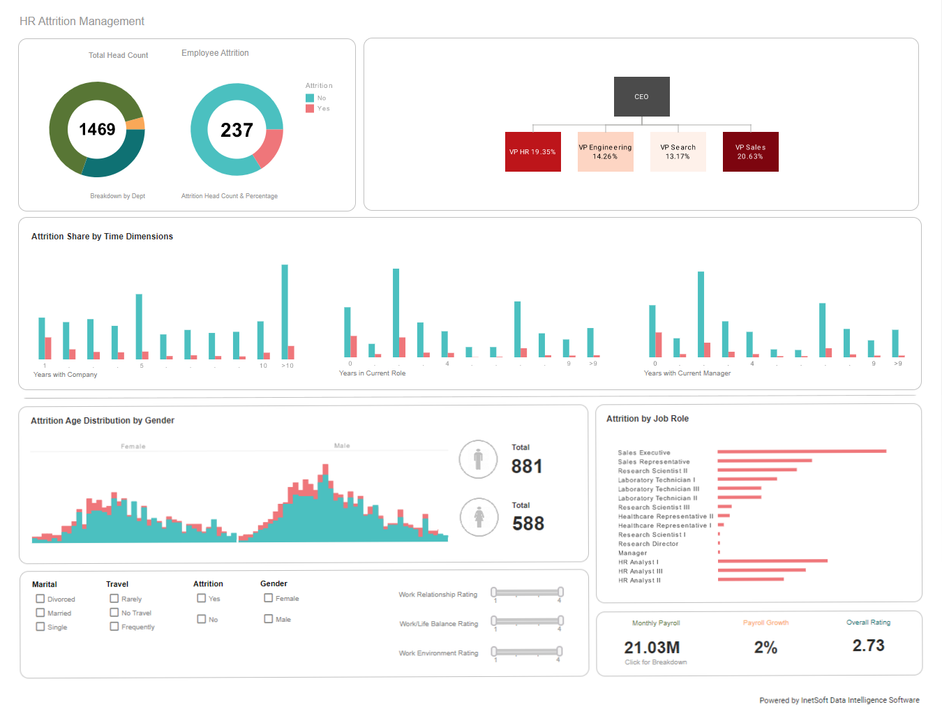
How Do I Make a User-friendly Dashboard?
If you've ever built a dashboard, you know how much work it can be. It's not just about getting your data in the right place and displaying it in an attractive way. It's also about making sure that what you're showing is easy to understand. The last thing anyone wants is for them to spend an hour trying to figure out what's going on with their dashboard before they can even begin using it properly. That's why we are going to share some tips and tricks on how we make user-friendly dashboards.
Big, bold data
One of the best ways to make a user-friendly dashboard is to use big and bold data. This can be done in many different ways:
- Use icons and other visual cues (like colors) to highlight important points of data.
- Use charts to show comparisons between two or more sets of numbers. For example, if you have sales numbers for each month and want your users to know which months had higher sales than others, you could use a graph with two sets of bars representing each month's total sales value across all products sold during that time period.
- Tables are useful because they allow people who aren't familiar with Excel spreadsheets or databases. They're also great for showing relationships between different pieces of information using rows & columns instead of just lines connecting them together like graphs do (which isn't always helpful).
| #1 Ranking: Read how InetSoft was rated #1 for user adoption in G2's user survey-based index | Read More |
Build a framework and a story
To make a dashboard that's easy to use, you should consider the following:
- Show a broad view of what's happening. Think about how many users will be accessing your dashboard, including those who aren't technical experts and may not understand what they're looking at or what it means. Make sure that everyone has access to the same information in one place.
- Show detail if possible so people can see trends over time (e.g., "this month vs. last month"). You also want to include info about each data point so users know exactly which metric is being measured or tracked (e.g., "users" vs. "customers").
- Use comparison tools where possible, for example, comparing two sets of data could help highlight differences between them while still giving readers insight into their overall performance over time. For instance, "the number of requests per second increased by 20% since last month").
 |
View a 2-minute demonstration of InetSoft's easy, agile, and robust BI software. |
Follow design principles
The best way to create a user-friendly dashboard is to follow the principles of design. These include contrast, alignment, proximity, and repetition. They will help you create a visually appealing dashboard that's easy to use, organized and consistent across your entire site or app.
- Contrast: Use contrasting colors for elements that are close together in size or shape.
- Alignment: Make sure all text is aligned on the same line so it doesn't appear skewed when viewed at an angle.
- Proximity: Be careful not to place too many elements too close together because this can make them hard for users who have vision problems. It might also look cluttered if used indiscriminately throughout the whole website/app interface without any regard to how its appearance could affect usability by different users.
Implement usability testing
User testing is a great way to make sure your dashboard is easy for users to navigate, as well as effective
at telling them what they need to know. If you're using Usertesting.com, you can test with real people from
across the globe.
Here are some things that we recommend:
- Test with different types of users (e.g. children versus adults)
- Test with users who are not familiar with your product or service
 |
View live interactive examples in InetSoft's dashboard and visualization gallery. |
Easy-to-read typography
Easy-to-read typography is one of the best ways to make your dashboard user-friendly. The first step in making sure that your typeface looks good at a distance is choosing a font that's easy on the eyes.
- Choose a font size that feels comfortable for you and your audience. We recommend using 14 pixels or less as an average line height. This will help ensure readability without making text appear too small or blocky when viewed from across the room or on mobile devices like smartphones.
- Consider how far away people will be able to see it when reading through their browsers/screens with different resolutions than yours. For example, if they happen to be sitting at their desk with poor lighting conditions while working late into the night then your font may not look as clear as it should because there won't be enough contrast between the words and the background colors.
Color and contrast
To help your data stand out, use color and contrast to highlight important information.
- Highlight trends by using a bolder or brighter color than the rest of your dashboard. It's easy to get distracted by bright colors in an otherwise drab space, but they can be very effective when used sparingly.
- Use different colors for different types of data: blue is typically associated with positive feelings, while red represents danger and risk—both emotions that are appropriate for different types of metrics.
 |
Read the top 10 reasons for selecting InetSoft as your BI partner. |
White space
The empty space on your page is called white space. White space is important because it helps people focus on what they are reading and looking at, rather than being distracted by other things. It also helps create a hierarchy of content that makes sense to viewers.
Size and width of your dashboard
The size and width of your dashboard depends on the audience. If you are building a dashboards for executives, then you should make sure that it is large enough for them to see all the content at once and easily navigate through it. But if you are building dashboards for non-business users, then it should be small enough so that they can still read everything without scrolling too much.
Keep it simple and clutter-free
Make sure you don't add too many features to your dashboard, as this can make it hard for users to find the data they need and understand what they're looking at. If a user has trouble finding their data or understanding it, they'll probably leave and go to the next website or app.
Read what InetSoft customers and partners have said about their selection of Style Scope for their solution for dashboard reporting. |
Icons are for clarity and efficiency
Icons are a great way to communicate complex information quickly. They can be used in the same way as words, but they have the added benefit of being more memorable and easier to understand. Icons allow you to communicate ideas quickly and clearly, which is important when you're trying to make sure your users know what you're trying to tell them.


