InetSoft's Interactive Airport Delay Visualization
All your bags are packed and you're ready to go...but have you checked to see if there any delays at the airport?
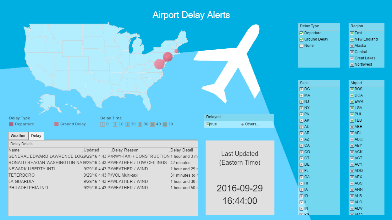
The Interactive Airport Delay Visualization is a free dashboard that is continuously updated from live FAA data. This browser-based application allows users to intuitively filter by region, state, airport, delay status and delay type, and displays multiple simultaneous results. This is a free interactive dashboard from InetSoft, an innovator in dashboards, reporting and mashups.
Open The Interactive Airport Delay Visualization Now
What Can You Do With This Interactive Dashboard?
- Filter by region, state, airport, delay status and delay type, to display multiple simultaneous results derived from live FAA data.
- Views results by delay information, weather information, or map view.
About InetSoft
The Interactive Airport Delay Visualization has been deployed using Visualize Free; a free visual analysis tool based on the advanced commercial dashboard and visualization software developed by InetSoft. Visualize Free permits anyone to upload and sift through multi-dimensional data to spot trends and aberrations or slice and dice data with simple point-and-click methods, and gives users the option to share their visual analysis with others or keep it private. To try Visualize Free, please visit www.visualizefree.com.
For a demo of InetSoft's commercial software or to register for more information:
What KPIs Are Used for an Airport Baggage Handling System?
Key Performance Indicators (KPIs) play a crucial role in assessing the efficiency and effectiveness of an Airport Baggage Handling System (BHS). These metrics help airport authorities and management ensure smooth operations, enhance passenger satisfaction, and maintain overall system reliability. Here are some significant KPIs for an Airport Baggage Handling System:
- Baggage Processing Time:
- Definition: The total time it takes for a passenger's checked baggage to travel from the check-in counter to the aircraft loading area.
- Importance: Lower processing times indicate efficient handling, reducing the likelihood of delays and enhancing passenger experience.
- Baggage Mishandling Rate:
- Definition: The percentage of mishandled bags in comparison to the total number of processed bags.
- Importance: A lower mishandling rate is crucial for customer satisfaction and helps avoid issues such as lost or delayed baggage.
- System Uptime:
- Definition: The percentage of time the baggage handling system operates without disruptions.
- Importance: High system uptime is essential for maintaining smooth operations and avoiding disruptions to flight schedules.
- Baggage Sorting Accuracy:
- Definition: The percentage of bags correctly sorted to their designated flights.
- Importance: Accurate sorting ensures that bags are delivered to the correct aircraft, reducing the risk of missed flights and improving overall system reliability.
- Baggage Tracking:
- Definition: The ability to track the location of a bag throughout its journey within the airport.
- Importance: Advanced tracking systems enhance transparency and enable quick retrieval of misplaced baggage, improving customer service.
- Baggage Conveyor System Capacity:
- Definition: The system's ability to handle a specific volume of bags per hour.
- Importance: Ensuring that the conveyor system can handle peak passenger loads helps prevent bottlenecks and delays during busy periods.
- Cost per Processed Bag:
- Definition: The cost incurred for handling each piece of checked baggage.
- Importance: Monitoring costs per bag helps optimize operations and identify opportunities for cost savings without compromising service quality.
- Security Compliance:
- Definition: Adherence to security regulations and screening procedures for checked baggage.
- Importance: Ensuring compliance with security standards is essential for passenger safety and regulatory compliance.
- Maintenance Downtime:
- Definition: The time taken for scheduled or unscheduled maintenance activities.
- Importance: Reducing maintenance downtime helps maintain operational efficiency and prevents disruptions to baggage handling services.
- Environmental Impact:
- Definition: The system's carbon footprint and environmental impact.
- Importance: Assessing and minimizing environmental impact aligns with sustainability goals and regulatory requirements.
More Articles About Visualization Technology
Add a Ranked Chart to a Churn Dashboard - Finally, add a Bar Chart that displays "importances" determined by machine learning. Drag a new Chart component above the Pie and Scatter Charts, and open the Chart Editor. For this Chart, use the 'importances' data block as the data source. Right-click on the 'importance' field and select Convert To Measure. Then drag it from the Measures folder to the...
Crisis Management Dashboard KPIs - KPIs that assess the situation's severity are at the center of any crisis management dashboard. These indicators aid companies in comprehending the crisis' possible effects on their activities, reputation, and stakeholders. Measures like "Magnitude of Impact" place a number on how big the issue is, whether it's a natural catastrophe or a hit to one's image. For emergencies that have the potential to grow quickly...
InetSoft's Business Intelligence Mapping Software - InetSoft's business intelligence mapping software allows for interactive analysis of geographic performance. InetSoft is top-rated by users on G2 Crowd. Interact with examples and register for a personalized demo. BI Mapping Software allows for the visualization of demographic data, helping the VP to understand the specific needs of different communities...
KPIs for Investment Operations Analysts - Portfolio Diversification: The key to controlling risk in investing portfolios is diversification. Analysts of investment operations evaluate portfolio diversity using a variety of metrics, including sector allocation, beta, and correlation coefficient. These analytics assist in identifying concentration hazards and portfolio rebalancing to improve risk-return profiles...
Resources for Access Dashboard Builders - Searching a Microsoft Access dashboard builder? InetSoft offer free and commercial Web-based dashboarding software that connects to MS Access and other data sources. The drag and drop designer makes design easy and quick. The chart engine makes attractive looking charts, and the toolbox includes many choices of dashboard components like gauges and speedometers...


