Searching for KPI Dashboard Examples?
Below are examples of KPI dashboards designed using InetSoft's drag and drop dashboard solution, some of which can be tested with the free downloadable evaluation copy of StyleBI, while others can be seen in the free visualization tool, Visualize Free. Click on an image below to enlarge the dashboard. When done, click anywhere to return.
Management Dashboard

This management KPI dashboard example gives a broad visual breakdown of revenue, prices, and profits, by product line. Color is used in several of the charts to add another dimension. The live version features a mouseover chart, packing in even more information without wasting dashboard real estate.
Customer Service Dashboard

This customer service KPI dashboard example gives shows call center managers how many calls their employees are handling and how long they are taking. The dashboard refreshes every 30 seconds, with individual employees represented with icons that change color when the employee is on the phone.
Enrollment Dashboard
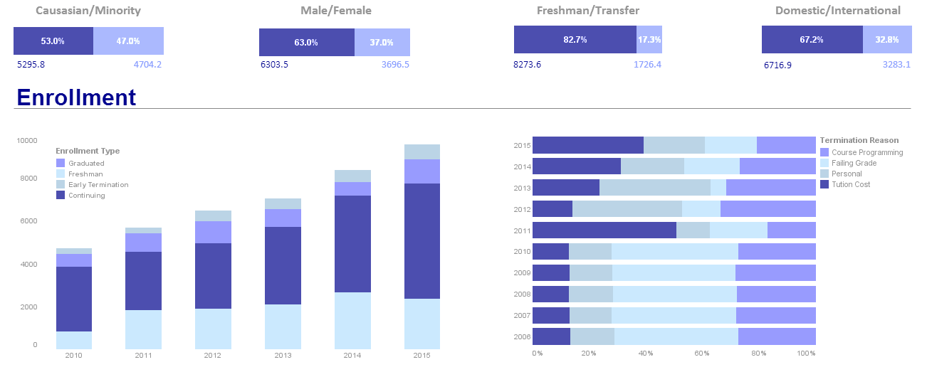
This enrollment dashboard breaks down enrollment by various demographic and psychographic factors, such as race, gender, major type, transfers, and year.
Text labels on the top bar charts add another level of detail to the dashboard real estate.
Marketing Dashboard
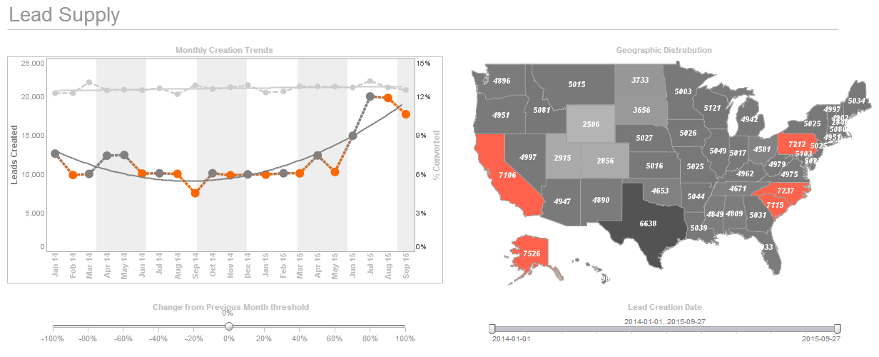
This marketing management KPI dashboard displays important aspects of the sales funnel, by displaying leads by source, state and date. Both top charts include a highlight feature based on monthly change rate, whose threshold can be adjusted using a slider which modifies the change rate that results in a chart highlight. The dashboard template gives an overall picture of new leads, their sources, and their conversion rates.
Operations Dashboard
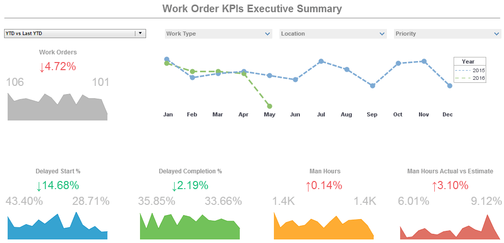
This operations dashboard example displays the percentage of work orders started and completed, and tracks the man hours necessary for completion of said work orders. A number of line charts display the fluctuations in these various measures over time, enabling managers to pinpoint where specific issues occurred.
Sales Dashboard
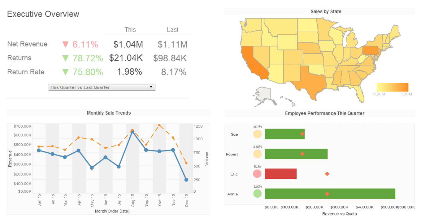
This sales dashboard template gives a broad visual breakdown of revenue, prices, and profits, by product line.
Color is used in several of the charts to add another dimension.
Popular Music Dashboard

This flexible KPI dashboard example by InetSoft can be easily embedded into applications to help creators find the next hot music genre in certain areas. In the example dashboard, the most important audio features impacting popularity are identified by regression model. Moreover, end user can deep dive into the music fusion by checking simulated decision tree of genre classification.
Loan Dashboard
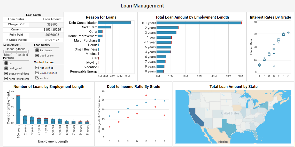
This loan dashboard example is an indispensable solution that delves deep into loan attributes and borrower characteristics. By analyzing factors such as loan purpose, grade, employment length, debt-to-income ratio, and more, this dashboard equips lenders with data-driven insights that optimize loan strategies and ensure a seamless lending process.
Reasons to Evaluate InetSoft's KPI Dashboard Application
InetSoft's KPI dashboard software is robust enough to:
- grab the attention of executives
- meet the demands of power users
- scale up for organizations of all sizes
and is easy enough to be:
- deployed in weeks, not months
- learned by end-users with minimal training
and flexible enough to:
- adapt to changing data structures and business needs
- accommodate data exploration through visualization and maximum self-service
