Searching For Performance Dashboard Examples?
A performance dashboard is a business management tool that will allow a business to keep track of all aspects of their daily activity. Below are examples of performance dashboards built with InetSoft's easy-to-use dashboard software. For example, the sales performance dashboard is able to track your sales on the east coast and compare them with your sales on the west coast.
When one of those sales unexpectedly rises or falls, you are able to investigate the reasons behind this and make the necessary changes to keep your business profitable. By converting your businesses numerical data into graphical or visual representations, performance dashboards allow the users to gain better insight to the more intricate parts of their business that they previously did not understand.
Various Types of Performance Dashboards
Performance dashboards should allow businesses to do the following:
- Monitor critical business processes and activities using metrics of business performance that trigger alerts when potential problems arise and when goals are met.
- Analyze the root cause of problems by exploring relevant and timely information from multiple perspectives and at various levels of detail.
- Manage people and processes to improve decisions, optimize performance and steer the organization in the right direction.
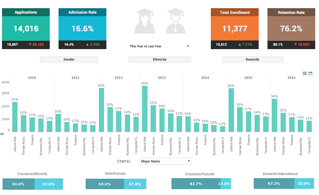
This live enrollment performance dashboard breaks down enrollment by various demographic and psychographic factors, such as race, gender, major type, transfers, and year.
Text labels on the top bar charts add another level of detail to the dashboard real estate.
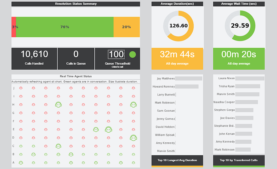
This live customer performance monitoring dashboard example gives shows call center managers how many calls their employees are handling and how long they are taking.
The dashboard refreshes every 30 seconds, with individual employees represented with icons that change color when the employee is on the phone.
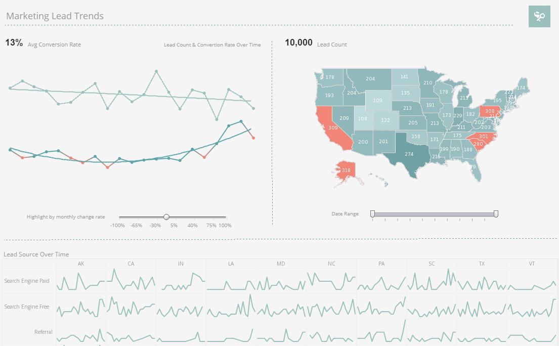
This live marketing performance dashboard displays important aspects of the sales funnel, by displaying leads by source, state and date. Both top charts include a highlight feature based on monthly change rate, whose threshold can be adjusted using a slider which modifies the change rate that results in a chart highlight. The dashboard template gives an overall picture of new leads, their sources, and their conversion rates.
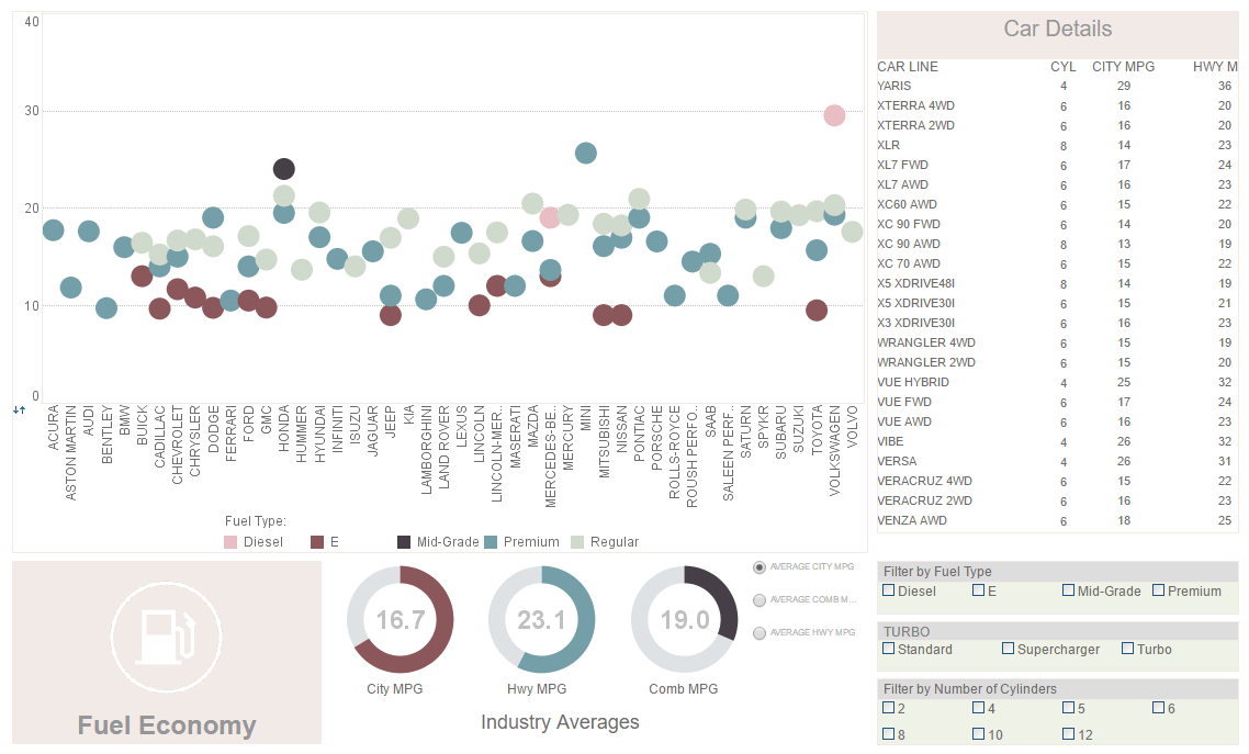
This visualization displaying the performance of various vehicles once again displays the utility of having color as an extra dimension. A radio button changes the means by which efficiency is measured, enabling a simpler, clearer dashboard layout.
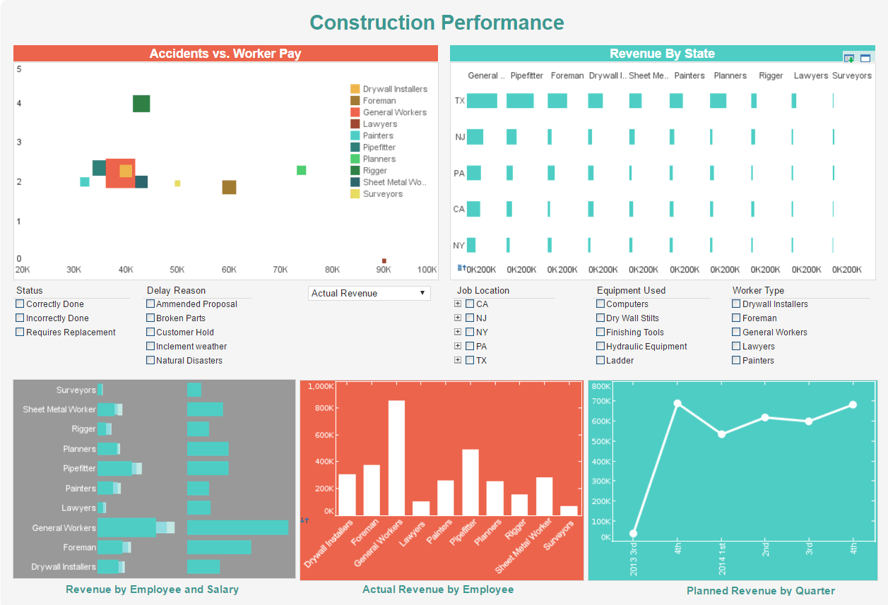
This dashboard gives property developers an overview of construction projects, including costs, timeliness, and worker safety. Drilldown buttons on the Revenue by Quarter chart enables the user to pinpoint periods of high and low activity.
This music performance dashboard example by InetSoft can be easily embedded into applications to help creators find the highest performing music genre in certain areas. In the example dashboard, the most important audio features impacting popularity are identified by regression model. Moreover, end user can deep dive into the music fusion by checking simulated decision tree of genre classification.
This social media campaign performance dashboard can free business users from juggling multiple social media channels across various platforms, and allow them to monitor accounts and track engagement metrics all in one place. The dashboard consists of a combination of easy-to-understand charts such as summary charts, line charts, bar charts, and pie charts to present engagement information across multiple platforms, and uses interactive filters to simplify the process of making analysis and comparisons.
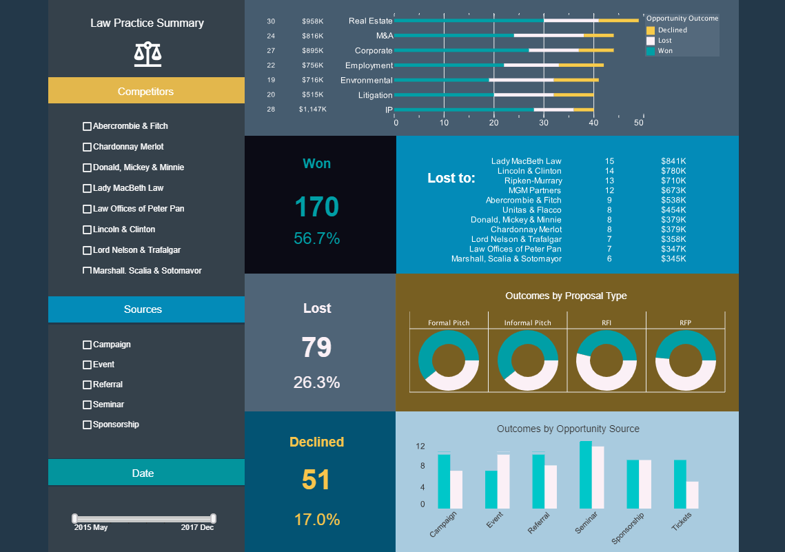
This legal services dashboard tracks wins and losses with large, easy to read KPIs, as well as breaking down said wins and losses with various charts. The template could also be used as a CRM dashboard, tracking lost and won opportunities by type.
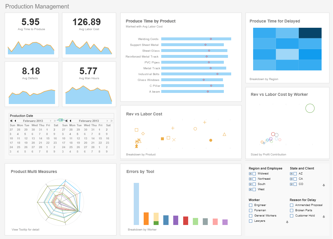
Using performance data and metrics within a company, this production performance dashboard measures production efficiency, enabling shop managers to meet their deadlines with ease. The dashboard graphically represents the status of each phase of the manufacturing process, provides managers with great insight to act accordingly and make decisions in a confident manner.
Performance Dashboard Components
Performance Dashboards primarily consist of two main entities. These entities are metrics/key performance indicators (KPI) and dimensions.
When we are referring to metrics, we mean direct numerical measures that represent a piece of business data in the relationship of one or more dimensions. For example a metric can be "total profit per month." The measurement in this case would be in dollars (total profit), and the dimension would be time (month). Key performance indicators are similar, because they are simply a metric tied to a goal. For instance, if the metric was "total profit per month," and we have set goals at $10,000 dollars per month, our key performance indicators can tell us if we are on pace to achieving our goals, ahead of our goals, or falling behind.
Dimensions break down data into groups. Each group will generate a unique metric or KPI accordingly. In the above example, the month dimension will generate one aggregated metric number per month.
With InetSoft's unique drag and drop dashboard design, you are able to fully customize reports geared toward your specific business. You have full control over with metrics and key performance indicators (KPI) that you wish to choose, and are able to combine and conform them to your growing business.
