Popular Business Dashboard Examples
For businesses that generate numerous reports in multiple departments, gathering and analyzing all the data is critical for success. An effective business dashboard is an important tool that enables leaders to view the big picture of their company in an instant.
InetSoft's dashboard software uses a visualization-driven approach to enable rapid deployment of self-service business dashboards. They are business user-driven and offer strong analytic functions. The key advantages:
- Monitor, explore, and analyze and drilldown into details
- Easy to use, modify, and create
- Leverage user-driven data mashup
- Suitable for executive dashboards and power-user exploration
Community College Dashboard

This admissions officer dashboard breaks down admissions by various demographic and psychographic factors, such as race, gender, major type, transfers, and year. Large, easy to read text KPIs display the dashboard's most important aggregates, with percent change from previous period displayed underneath them.
Purchasing Manager Dashboard

This dashboard eneables purchasing managers to see which states have the highest orders and which salespeople are performing. Sales goals are represented by diamond shape elements for easy comparison.
Medical Clinic Dashboard

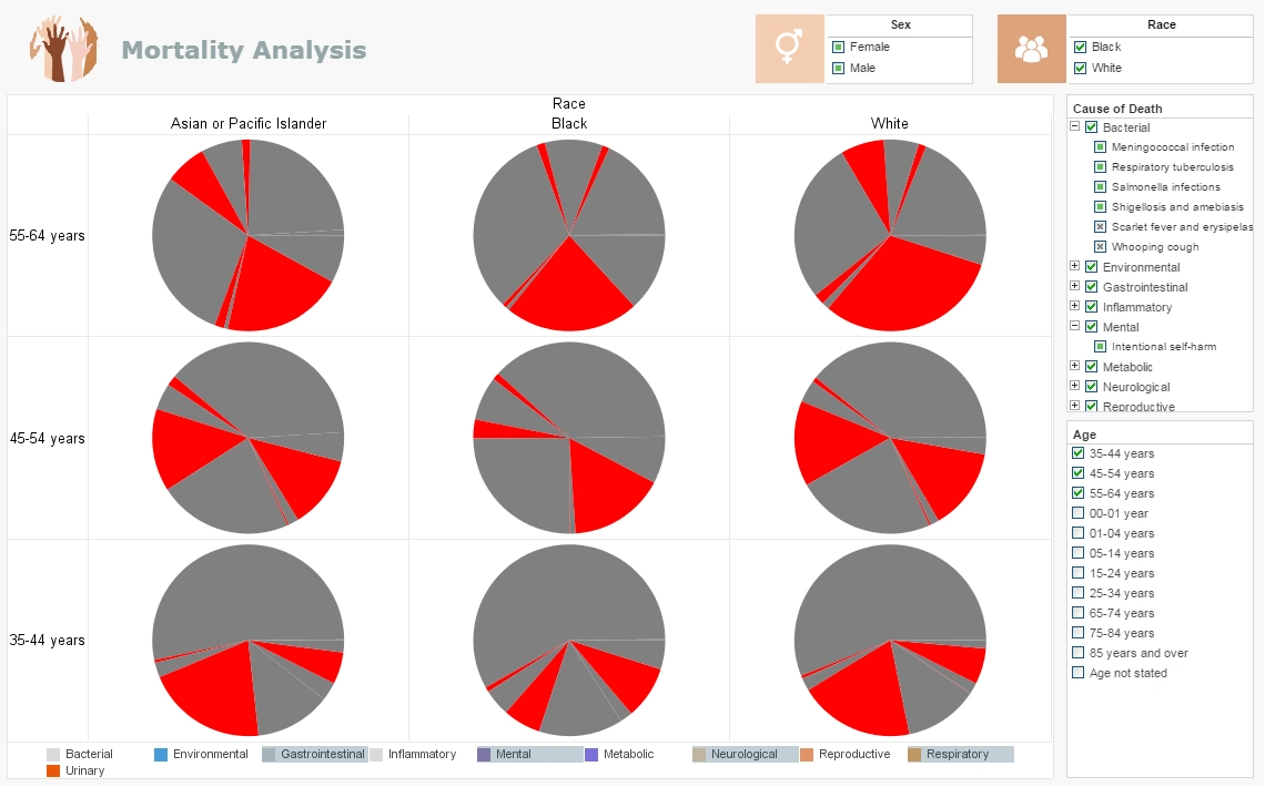
In this medical report example you can easily wring out a huge variety of statistics surrounding national mortality. The visuals can be displayed by age, race, gender or cause. You can filter out specific diseases within each Cause or zoom in for an intimate analysis within certain communities. Easily spot the major causes or drill down to find the way certain causes affect demographics differently.
Product Manufacturer Dashboard

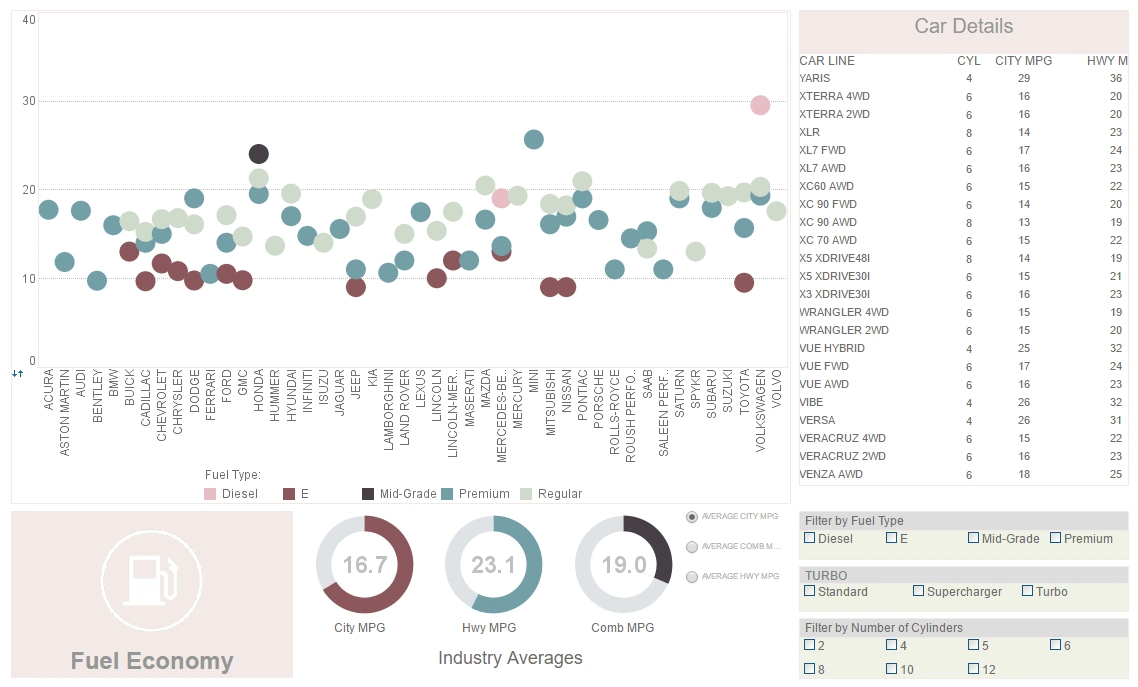
This analytics example uses multidimensional charting and KPI guages to display the fuel efficiency of over 500 different vehicles. A detail table displays each vehicle's individual data, enabling brand outliers to be identified.
An Insurance Director Dashboard

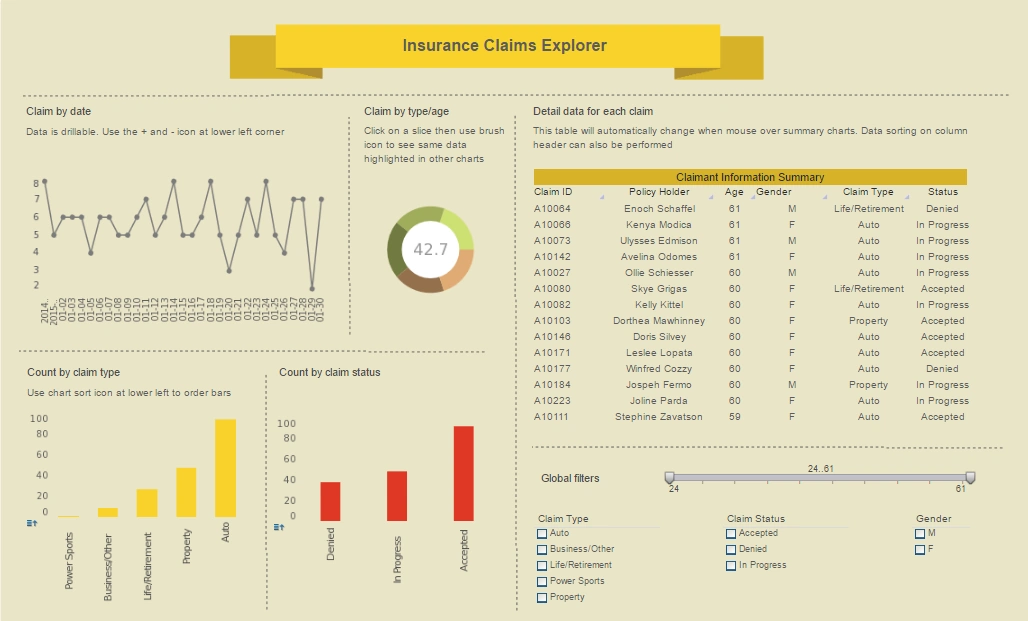
This insurance director dashboard helps insurance adjusters better estimate insurer risk. Breakdowns of claims by age, date, and status give a high level view of risks and payouts.
A Facilities Executive Dashboard

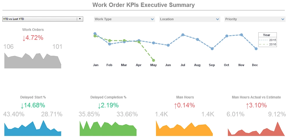
This facilities executive dashboard sample displays the percentage of work orders started and completed, and tracks the man hours necessary for completion of said work orders. A number of line charts display the fluctuations in these various measures over time, enabling managers to pinpoint where specific issues occurred.
Social Media Marketing Visualization

This social media marketing dashboard can free business users from juggling multiple social media accounts across various platforms, and allow them to monitor accounts and track engagement metrics all in one place. The dashboard consists of a combination of easy-to-understand charts such as summary charts, line charts, bar charts, and pie charts to present engagement information across multiple platforms, and uses interactive filters to simplify the process of making analysis and comparisons.
Restaurant Delivery Platform

Combining the capabilities of data mashup with powerful visualization, the restaurant delivery platform dashboard created using Inetsoft's StyleBI caters to the requirements of food delivery app analysts who are looking to derive important insights that can help their business offer better service to their customers and generate higher revenue. The unique device adaptability feature of Inetsoft's StyleBI makes it easy to switch between multiple devices without compromising on the interactivity of the dashboard.
Pages with Industry Dashboard Examples
-
Interactive Industry Dashboard
Examples
This page showcases a range of live, web‑based dashboards tailored for specific industries—such as marketing management, higher education, insurance claims, CRM, and telecommunications—featuring interactive filters, maps, sliders, and drill‑downs. Each example allows users to explore industry KPIs in real time using InetSoft's Style Scope visualization engine, enabling ad-hoc data inquiries with point‑and‑click ease :contentReference[oaicite:0]{index=0}. It's a compelling demonstration of how industry teams can self‑serve analytics without IT intervention.
-
Manufacturing Analytic Dashboards Using Data
Intelligence
This page highlights manufacturing dashboards built on StyleBI designed to monitor assembly lines, quality control, supply chain, and production cycle time, with live examples of defect-rate heatmaps and downtime analyses :contentReference[oaicite:1]{index=1}. It emphasizes real-time alerts and mash-up of heterogeneous factory data for visibility across globally dispersed operations. The solution supports rapid deployment with minimal IT overhead and dynamic, ad-hoc reporting for production and operations management.
-
Production Dashboard Example
This article outlines a production monitoring dashboard that enables managers to track metrics such as units produced without error, machine downtime, and worker-related errors—all within an interactive, mobile-accessible interface :contentReference[oaicite:2]{index=2}. The dashboard incorporates layered executive views, including profit by product type and safety incident trends. Alerts and real-time visual cues ensure immediate awareness of underperformance.
-
Business Intelligence Dashboard Examples
This page presents BI dashboard examples with industry relevance—covering HR attrition, maintenance efficiency, PMO timelines, sales performance, risk, and demographic analysis—complete with Gantt charts, color-coded KPIs, and multidimensional drill-downs :contentReference[oaicite:3]{index=3}. Each example illustrates how to combine executive scorecards with operational insights in one interface. The variety of visual types shows the platform’s flexibility across functional scenarios.
-
Industry Dashboard Solutions
This comprehensive showcase presents interactive dashboards for sectors like insurance claims, pharmaceuticals, real estate, retail, steel, telecom, and more—each demonstrating live-filtering, mashups, and multi-chart interplay. It highlights how InetSoft’s Data Intelligence platform unifies disparate sources to deliver timely, cross-industry analytics. The examples illustrate interactive bubble charts, heat maps, parameterized reports and predictive analytics in an accessible interface. :contentReference[oaicite:0]{index=0}
-
Monitoring & Management Dashboards
Examples
This gallery includes role-specific dashboards for project management, telecom network utilization, manufacturing production, and healthcare patient mortality—each with real-time KPIs, Gantt charts, call-quality maps and drill-down capabilities. It emphasizes how StyleBI enables self-service visualizations across functions, with instant insight into operational performance. The page also notes InetSoft's recognition on G2 Crowd for platform excellence. :contentReference[oaicite:1]{index=1}
-
Interactive Dashboards for Data Science
This article focuses on dashboards tailored for data science use cases, showcasing integration with R/ML–driven models and dynamic feature input visualization. It demonstrates how analysts can create predictive, real-time dashboards using drag-and-drop design without manual coding. Additionally, it cites InetSoft’s high user rankings on G2 and design flexibility suitable for data science teams. :contentReference[oaicite:2]{index=2}
-
Enterprise Data Management Software
This article describes StyleBI’s real-time data transformation and mashup capabilities for enterprise dashboards, highlighting drag-and-drop reshaping of live data sources without traditional ETL. It underscores benefits like agile data virtualization, prototyping, and OLAP/warehouse integration across diverse systems. It also points to interactive demos and mashup-based data intelligence benefits. :contentReference[oaicite:3]{index=3}
-
KPI Dashboard Examples
This page offers a variety of KPI dashboard templates—including management, customer service, enrollment, marketing, operations, sales, loan, and music industry examples—featuring drill-down, color-coded KPIs, and interactive sliders. It emphasizes the value of combining metrics with dimensions for clear, goal‑oriented analytics. The examples showcase how to visually present high-level performance with granular interactivity. :contentReference[oaicite:4]{index=4}