Information about InetSoft's Tools for Creating Multidimensional Dashboards
Looking for tools for creating 3D dashboards? InetSoft offers Web-based dashboard software that has been deployed at several thousand enterprises worldwide spanning several industries. For a commercial version, visit the StyleBI product page, and see examples, view a demo, and read customer reviews. A free option can be found at and https://www.visualizefree.com/. View information about InetSoft's agile dashboard creation software:
Performance Measurement Dashboard - From conversion and turnover rates, customer profitability or financial metrics including revenue per employee and forecast accuracy of budget, companies constantly have to measure their performance on a daily, monthly, quarterly and even yearly basis between departments through various data visualizations. However, it can become difficult for organizations to create performance measurement dashboards or key performance indicators, KPI's, without a proper business intelligence program that can meet all their needs. The solution is InetSoft's Style Intelligence, an intuitive and robust business intelligence platform that enables anyone from the typical end-user to those with IT experience to create and visualize data into dashboards, worksheets and reports conveniently and efficiently. StyleBI provides businesses...
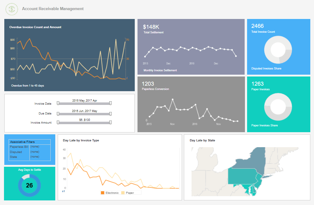 |
Click this screenshot to view a two-minute demo and get an overview of what
InetSoft’s BI dashboard reporting software, StyleBI, can do and how easy it is to
use.
|
Performance Tracking Dashboard Application - Looking for a performance tracking dashboard for tracking KPIs and managing performance? Since 1996 InetSoft has been making dashboard software that is easy to deploy and easy to use. Its unique data mashup capabilities enable unified views of corporate performance and maximum self-service...
Pharmaceutical Testing Dashboard Utility -InetSoft's pharmaceutical testing analytics provide a means to measure and evaluate the performance of drug testing trials. Researchers can assess the efficacy and safety of the drug candidate, monitor patient recruitment rates, track protocol adherence, and evaluate the overall progress of the trial...
Pioneering Dashboard Tools for Visualizing Data - Are you researching dashboard tools for visualizing data? InetSoft's pioneering dashboard application makes it easy to create great-looking web-based visualizations with an intuitive drag-and-drop designer. Get cloud-flexibility for your deployment. Minimize costs with a small-footprint solution. Maximize self-service for all types of users. No dedicated BI developer required. View a demo and try interactive examples...
Pipedrive Dashboard Solution - Looking for a good solution for Pipedrive dashboard reporting? InetSoft's pioneering BI application produces great-looking dashboards that give you more self-service analytic capabilities. View a demo and try interactive examples...
PipelineDeals Dashboard Solution - Looking for a good solution for PipelineDeals dashboard reporting? InetSoft's pioneering BI application produces great-looking sales team dashboards that give sales manaagers more self-service analytic capabilities. Get a personalized demo and free evaluation assistance...
Platform for IoT Dashboard - Are you looking for a good IoT dashboard platform? InetSoft's pioneering dashboard reporting application produces great-looking web-based dashboards with an easy-to-use drag-and-drop designer. Analyze sensor data, run ML models, and visualize results. Get cloud-flexibility for your deployment. Minimize costs with a small-footprint solution. Maximize self-service for all types of users. No dedicated BI developer required. View a demo and try interactive examples...
| #1 Ranking: Read how InetSoft was rated #1 for user adoption in G2's user survey-based index | Read More |
PMO Reporting Dashboard Solution - Looking for a good PMO reporting dashboard application? InetSoft is a pioneer in self-service dashboarding and offers an easy tool for project management. View a demo and try interactive examples...
Popular Business Dashboard Examples - For businesses that generate numerous reports in multiple departments, gathering and analyzing all the data is critical for success. An effective business dashboard is an important tool that enables leaders to view the big picture of their company in an instant. InetSoft's dashboard software uses a visualization-driven approach...
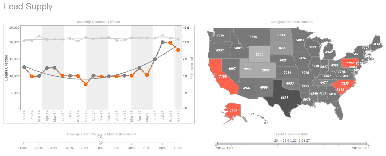 |
Click this screenshot to view a two-minute demo and get an overview of what
InetSoft’s BI dashboard reporting software, StyleBI, can do and how easy it is to
use.
|
Portlet Dashboards - The following sections introduce you to the monitoring capabilities available in StyleBI, Portlet Dashboards and Scorecards. A portlet dashboard is a visual monitoring tool that presents a cluster of display components on a single screen. A portlet dashboard is a visual monitoring tool that presents a cluster of display components on a single screen. These components are typically used to display Key Performance Indicators (KPIs) that provide rapid comprehension of business activities. StyleBI gives you the ability to configure and set up your own portlet dashboards and subscribe to existing dashboards. The next sections explain how to do this. Portlet dashboards are different than the Viewsheet dashboards described in Visual Exploration. Portlet dashboards are oriented toward monitoring and tracking, while Viewsheet dashboards are oriented toward exploration and knowledge discovery. When you log in to the Report Portal for the first time, you will see a set of default dashboards. For example, to see the dashboard below, follow these steps...
Post-Mortem Dashboards - A post-mortem dashboard is an effective tool that gives organizations the ability to assess their performance after the conclusion of a project, event, or other major activity. It offers insightful information on what worked well and what may be improved for next attempts. A post-mortem dashboard uses a variety of Key Performance Indicators (KPIs) and analytics to efficiently evaluate a project's progress. In this article, we'll look at the crucial KPIs and analytics that are often utilized on post-mortem dashboards to assist companies get insightful information and make data-driven choices.
Progression from Reports to Dashboards - And then, of course we have integration in order to pull data together. We have search as part of our experience. We have associative search so you can find answers with your data anywhere. And of course we have the great visualization that we built on top of that. And the result of this analysis is a focused and personal aspect of what we do. Think of it as a progression from reports, to dashboards, to apps. Typically you think of it this way. Reports enable you to view information, and that’s very much the model of publishing and viewing. Dashboards allow you a certain amount of interaction, a certain amount of drill down, to find out what are the numbers that made the numbers. But apps are really about an exploratory interface and Style Intelligence can do all these things. We can do reports. For example, something like this is a straightforward report although a traditional type. With a dashboard that we could build with our tool would be similar, but we can drill down into it. And this dashboard is typical of a lot of dashboards that I use. People like the gauges and want this sort of visualization. Very often if it’s the style of the visualization that’s as important as the information to a lot of people that I find. And so, dashboard enables you to drill down. But the thing that StyleBI can do that is special is build something which is not just a report, not just a dashboard. It’s actually more like an application with interfaces that are very specific that lets you change the view of the data you see very easily...
Read what InetSoft customers and partners have said about their selection of Style Scope for their solution for dashboard reporting. |
Project Managers Use Dashboards - As any project manager will know, a project management dashboard is a helpful tool that contains and displays information about current projects. Dashboards generally try to show information in a clear format. Pulse of the Profession conducted a global survey about trends in the project management sphere, which indicated that project management tools are often forgotten about by companies. The study reports that 67% of organizations undervalue the importance of project management tools and the entire concept of project management. However, a lack of organization within a project can become a major issue and can ultimately cause projects to fail. This is where project management dashboards can make a huge difference. Ultimately, a project management dashboard can set critical matters in motion leading to more effective operations. Seeing all the information you need in a centralized location opens the door to promising possibilities. It also offers a plethora of advantages. Notably, it can present valuable information that improves project completion and helps achieve an organization's long-term goals. It's also all-encompassing and flexible. Not to mention, it provides actionable data, clarity, and in-depth user controls...
Project Management Dashboard - Project management has become an essential part of any business in order to stay goal-oriented and efficient. Project management is the science of ensuring that projects are completed on time- it involves breaking projects down into all of their components and calculating not only the estimated time for its components but also factoring in any possible delays...
Project Tracking Dashboard Application for Toggl - Looking for a good solution for Toggl dashboarding? InetSoft's pioneering BI application produces great-looking dashboards that mashup time tracking data with other enterprise data sources. View a demo and try interactive examples...
Prototyping a Dashboard - Are you looking for a good dashboard prototyping tool? InetSoft's pioneering dashboard reporting application produces great-looking web-based dashboards with an easy-to-use drag-and-drop designer. Get cloud-flexibility for your deployment. Minimize costs with a small-footprint solution. Maximize self-service for all types of users. No dedicated BI developer required. View a demo and try interactive examples...
Providing Detail Data in a Dashboard - So in this dashboard, you can see if you hover the mouse over a data point a box displays with detailed information about it. That information tooltip helps me provide a lot of information and explain the dashboard to the dashboard viewer. It can be information such as what does the metric represent, how it was calculated, what data is included or excluded, may be what the target of visuals I should have for my data. I could even include information around what type of interactions are there on the dashboards, so I can maybe save time on training or helping the user understand how this dashboard works or even in times what actions they need to take when they see the values under a certain condition or status. Another important thing to note about his help overlay is that it is designed in a way, which is semi-transparent, so I can still see the original values and the context of the explanation when I am looking at the explanation itself by using using the Show Details toolbar item. It's allows me to see the detail data behind the chart and even export it to a spreadsheet for other use such as in a powerpoint chart or some offline excel analysis...
 |
Read how InetSoft was rated #3 for implementation in G2 Crowd's user survey-based index. |
| Previous: Dashboard Analysis Software |
