Top Management Dashboard Examples
Marketing Project Management Dashboard Example

This project management marketing dashboard example aids in the monitoring of various marketing initiatives and the start and end times of various project stages. This type of dashboard helps digital marketing agencies track the progress of their consultants on various initiatives. A Gantt chart tracks the start and end date of various projects, giving a visual representation of project durations. Gantt charts now comes as a standard option in InetSoft's visualization engine.
Sales by State Performance Dashboard

This sales-by-state sales performance dashboard gives a broad visual breakdown of revenue, prices, and profits, by product line. Color is used in several of the charts to add another dimension. The live version features a mouseover chart, packing in even more information without wasting dashboard real estate.
Maintenance Efficiency Dashboard Example

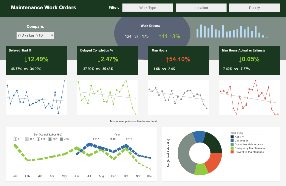
This maintenance efficiency dashboard displays the percentage of work orders started and completed, and tracks the man hours necessary for completion of said work orders. A number of line charts display the fluctuations in these various measures over time, enabling managers to pinpoint where specific issues occurred.
Risk Management Consultancy Dashboard

This risk management consultancy dashboard from InetSoft partner Protecht displays various measures of risk and compliance. An incidents by date chart features a red line tracking actual losses, utilizing color to draw the users attention to what's most important.
Enrollment Demographics Dashboard

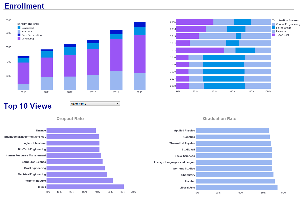
This enrollment dashboard breaks down enrollment by various demographic and psychographic factors, such as race, gender, major type, transfers, and year. Using color as a dimension another level of detail to the dashboard real estate.
Bank Demographics Analysis Dashboard

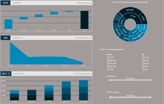
This interactive bank demographic report can help bank managers identify their most valuable customer demographics.
The sunburst chart on the top right is an effective way to show how different customer segments relate to each other.
Multidimensional Census Dashboard

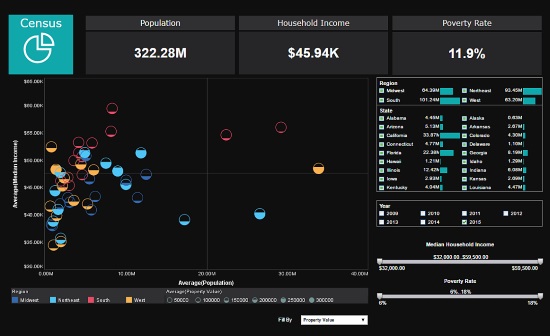
This multidimensional dashboard of US census data uses multidimensional charting to display population, income, region, and property value, all in a single chart. Various filter elements enable possible patterns in the data to be discovered and explored.
Manufacturing KPI Dashboard

This manufacturing KPI dashboard is designed to provide an overview of production times, costs, and errors, displayed with a variety of charts and text kpis. The Produce Time by Product chart compares production times for each product to set benchmarks, helping managers to assess performance at-a-glance.
A radar chart displays a variety of product measures. Text KPI's in the top left corner give an at a glance picture of the factory's overall performance.
Help Center Online Dashboard Portal

This real-time help center management dashboard portal gives shows call center managers how many calls their employees are handling and how long they are taking. The dashboard refreshes ever 30 seconds, with individual employees represented with icons that change color when the employee is on the phone.
See a Management Dashboard Demo
The best way to keep your finger on the pulse of your enterprise is with business intelligence dashboards. Top management face the challenge of making sure that day-to-day business activities are aligned with the company's long-term goals. One way to periodically and conveniently track performance is with dashboards displaying Key Performance Indicators (KPIs).
In general, no software application is going to provide top management with KPI's ready-to-use, since KPI's are metrics that are often derived from formulae that are specific to an enterprise and need to be mapped into the software application.
With this in mind, InetSoft designs business intelligence solutions that are easy-to-deploy and easy-to-use. InetSoft's dashboard tool provides top management with visual analyses constructed in real-time by dropping data items into visual elements such as charts, graphs and gauges.
| More: Business Dashboard Examples |