Examples of Using Dashboards
Are you looking for examples of using dashboards? Dashboards offer companies, both big and small, the opportunity to streamline many previously thought independent aspects of their business. Dashboard examples come in many different styles and choosing the correct one for your business can lead to significant results.
Machine Upkeep Dashboard Example
Risk Management CFO Dashboard Example
Centralized Social Media Marketing Dashboard
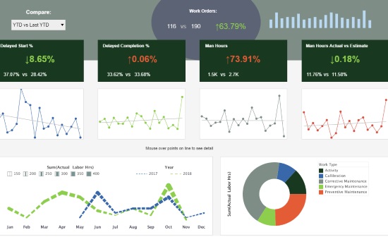
This machine operations dashboard example gives a high level view of all maintenance being performed.
Delays are tracked, enabling managers to monitor the timeliness of their workforce.

This risk management CEO dashboard from InetSoft partner Protecht displays various measures of risk and compliance. An incidents by date chart features a red line tracking actual losses, utilizing color to draw the users attention to what's most important.

This social media marketing dashboard can free business users from juggling multiple social media accounts across various platforms, and allow them to monitor accounts and track engagement metrics all in one place. The dashboard consists of a combination of easy-to-understand charts such as summary charts, line charts, bar charts, and pie charts to present engagement information across multiple platforms, and uses interactive filters to simplify the process of making analysis and comparisons.
SalesForce Dashboard Example
Loan Origination Dashboard Example
Workflow Efficiency Dashboard Example
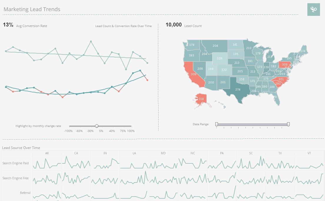
This SalesForce CRM marketing dashboard example gives marketing managers the metrics they need to monitor sales pipelines and optimize strategy. Lead count and source are tracked as well as conversion rates, with monthly change highlighted based on slider selection.
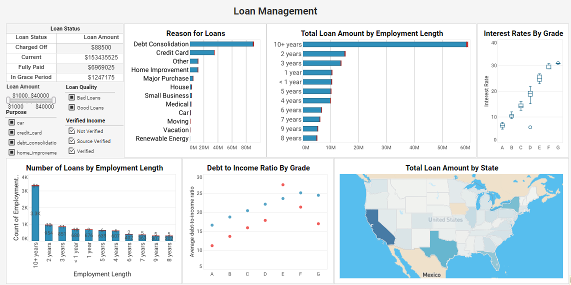
This lending assessment example is an indispensable solution that delves deep into loan attributes and borrower characteristics. By analyzing factors such as loan purpose, grade, employment length, debt-to-income ratio, and more, this dashboard equips lenders with data-driven insights that optimize loan strategies and ensure a seamless lending process.
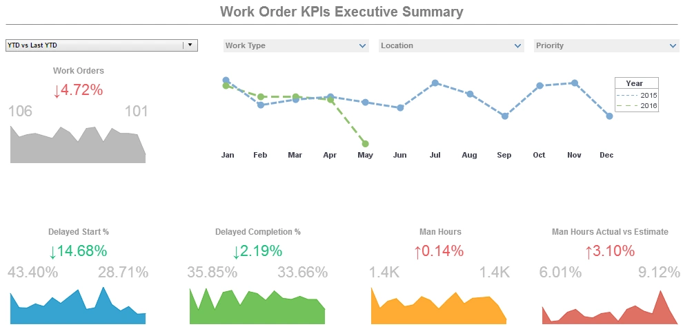
This operations work orders example displays the percentage of work orders started and completed, and tracks the man hours necessary for completion of said work orders. A number of line charts display the fluctuations in these various measures over time, enabling managers to pinpoint where specific issues occurred.
Media Analysis BI Example
Live Customer Service Dashboard Example
Sales by Type Dashboard Example

This media analysis dashboard example by InetSoft can be easily embedded into applications to help creators find the next hot music genre in certain areas. In the example dashboard, the most important audio features impacting popularity are identified by regression model. Moreover, end user can deep dive into the music fusion by checking simulated decision tree of genre classification.
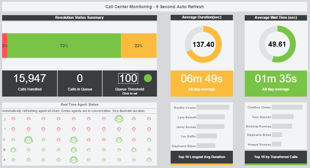
This real-time customer service BI dashboard example gives shows call center managers how many calls their employees are handling and how long they are taking. The dashboard refreshes ever 30 seconds, with individual employees represented with icons that change color when the employee is on the phone.

This sales-by-state dashboard example gives a broad visual breakdown of revenue, prices, and profits, by product line. Color is used in several of the charts to add another dimension. The live version features a mouseover chart, packing in even more information without wasting dashboard real estate.
Using dashboards in your company's business intelligence solution means that your are providing high quality, open standards base BI software to not only your company, but your employees as well. No matter which type of dashboard you are using, there are some type of metrics and key performance indicators that apply to each one. These metrics and KPI establish the basic means for what the company is trying to measure. For example, if your company sells shoes, you would be measuring your total profit over time. These dimensions are easily established using easy, agile, and robust BI software.
With InetSoft's unique drag and drop dashboard design, you are able to fully customize reports geared toward your specific business. You have full control over with metrics and key performance indicators (KPI) that you wish to choose, and are able to combine and conform them to your growing business.
Does InetSoft Offer Free Guided Evaluations?
Yes, InetSoft offers free guided evaluations of its dashboard software. These evaluations provide an opportunity for potential users to explore the features and capabilities of the software in a hands-on manner, with guidance from InetSoft's team of experts. This ensures that users can make informed decisions about how InetSoft's solutions can meet their specific business needs.
Does InetSoft Offer a Free Version of Its Dashboard App?
Yes, InetSoft offers a free version of its dashboard application called StyleBI Free Edition. This version is designed for departmental use and provides a subset of the features available in the full commercial version. Users can try out the software and see how it fits their needs before committing to a paid plan.
How Can I Get Started with InetSoft's Dashboard Software?
Getting started with InetSoft's dashboard software is easy. You can sign up for a free trial of the StyleBI Free Edition on the InetSoft website. This allows you to explore the software's features and capabilities without any initial investment. If you need more advanced features or support, you can consider upgrading to a paid plan that suits your business requirements.
Is There An Open Source Version of InetSoft's Dashboard App?
Yes, InetSoft offers an open-source version of its dashboard application, packaged as StyleBI Open Source, which includes a data transformation pipeline and visualization engine. It’s provided as a Docker container with source available on GitHub, enabling deployment on local or cloud environments and ideal for small teams or proof-of-concepts. For full enterprise features like multi-user access controls and advanced connectors, they offer commercial editions, but the open-source version provides a powerful, lightweight BI platform without license fees.
More Articles About Using Dashboards
-
Binding Charts Through Drag‑Drop
This article explains report design using StyleBI’s drag‑and‑drop chart binding features. It walks through binding data to charts, maps, crosstabs and cascading parameter sheets. Useful for anyone building structured, interactive reports without scripting. -
Deploying BI with Ease
Highlights using InetSoft’s BI suite to simplify deployment, self‑service dashboards, and data mashups. Emphasizes ease of use, cost savings, and rapid rollout. Ideal for organizations evaluating intuitive BI adoption. -
Mastering Report Design Visually
Covers the basics of using InetSoft’s Report Designer to build reports without coding. Describes flow and tabular layout models, element placement and GUI workflows. Perfect for developers wanting rapid report prototyping. -
Examples of Dashboard Usage Patterns
Discusses using reporting dashboards built with InetSoft for self‑service, exploration and monitoring. Shows how non‑technical users can quickly deploy dashboards with minimal IT involvement. Built for agility and real‑world adaptability. -
Three Step Dashboard Creation Guide
Describes how to make dashboards using StyleBI: load the viewsheet, upload data, and drag and drop visuals. Emphasizes simplicity and speed, even for users transitioning from spreadsheets. Highlights the intuitive visual composer interface. -
Web Charts Through Simple APIs
Explores building a real‑time dashboard using InetSoft’s web‑based APIs and visualization tools. Shows how to turn database data into live charts and heatmaps using built-in features. A guide for those integrating dashboards into web applications. -
Configuring On‑Demand Reporting
Provides information for on‑demand reports using InetSoft’s software, including scheduling, materialized views and email delivery. Describes configuring clusters, report server properties, and repository settings. Suitable for organizations automating report workflows. -
Building Unified Data Tables
Explains creating data tables using multiple queries and sources in StyleBI. Shows how to aggregate data into interactive tables for dashboards or reports. Useful for data mashup use cases without manual ETL. -
Monitoring Pipelines in StyleBI
Covers using the StyleBI data pipeline to transform, combine and monitor data flows with visual quality checks. Shows scripting and validation features in the accessible pipeline. Helps ensure informatics-quality data before visualization. -
Tracking Business Activity in Real Time
Describes monitoring business activity using StyleBI, combining multiple data sources to build operational dashboards. Explains using drill‑downs and alerts to stay on top of performance. Designed for users needing dynamic visibility into operations.
