Visualization Dashboard Examples
Visualization dashboards can help your business get to the next level. With the aesthetically pleasing look, combines with the in depth analysis that a visualization dashboard gives, it allow employees at any level the ability to interpret how their department s doing.
Upper management can now streamline the way different departments operate business on a daily basis, by pointing out the areas that are trending upward and those that are trending downward.
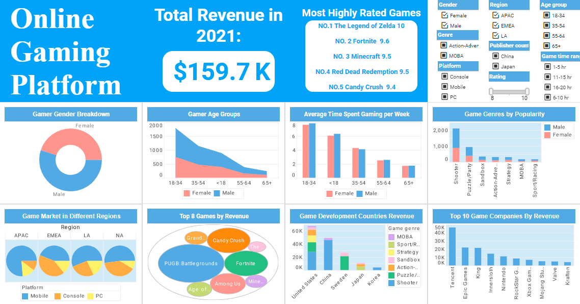
Using visualization dashboards can give your company a strategic edge when it comes to its Business Intelligence solutions. These dashboards allow companies to convert key numerical business data into graphical/visual representations that are easy to read and understand. They produce easy to read interpretations of business data, that are intended to help your business grow.
 |
View a 2-minute demonstration of InetSoft's easy, agile, and robust BI software. |
Social Media Marketing Visualization

This social media marketing dashboard can free business users from juggling multiple social media accounts across various platforms, and allow them to monitor accounts and track engagement metrics all in one place. The dashboard consists of a combination of easy-to-understand charts such as summary charts, line charts, bar charts, and pie charts to present engagement information across multiple platforms, and uses interactive filters to simplify the process of making analysis and comparisons.
Restaurant Delivery Platform
Combining the capabilities of data mashup with powerful visualization, the Online Food Delivery Analytics Dashboard created using Inetsoft's StyleBI caters to the requirements of food delivery app analysts who are looking to derive important insights that can help their business offer better service to their customers and generate higher revenue. The unique device adaptability feature of Inetsoft's StyleBI makes it easy to switch between multiple devices without compromising on the interactivity of the dashboard.
Quality Control System
This Manufacturing Quality Control Dashboard enables quality control managers to monitor and analyze everything, from defects rate and pipeline duration to shift performance and technician performance, all in one dynamic view. With built-in filtering components, manufacturing professionals can easily slice and dice data with simple point-and-click methods to get various insights.
Online Video Streaming

This online streaming analytics dashboard offers the managers at streaming companies not only an overall understanding of their user base, but also detailed analytics and comparisons of diverse channels, helping managers to triangulate target audience positioning and video content improvement, improving business value and ROI for companies that offer video streaming applications.
Law Enforcement Casualty Minimization
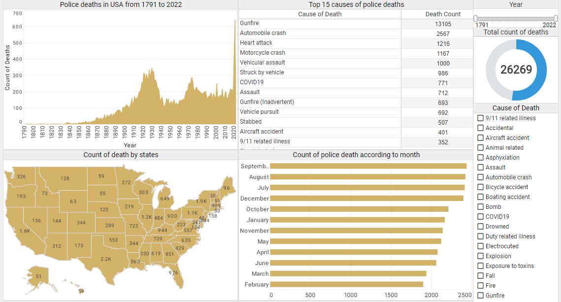
This interactive Police Force Deaths Analysis Dashboard that displays police fatality data since 1791, across 17,985 police departments in the United States. The visualization's charts and tables let users comprehend these vast amounts of data at a glance in a more efficient way. The dashboard also incorporates several tables to allow users to dive deep into more details. The tables list the top 15 death causes, the top 15 types of police officers in the most danger, and the top 15 departments with the most police deaths, providing details of police deaths that are the most relevant to analyze from an abundant amount of data.
Credit Approval Visualization

This credit dashboard that investigates several factors associated with credit card approvals, including income, debt, age, ethnicity, credit score, marriage status, and gender. It not only allows financial users to visualize the relationship between a single factor and credit card approval rates at a glance, it also helps users slice and dice relationships easily between different variables with built-in checklists and sliders. Through the intuitive charts and filter functions on this credit card approval analytics dashboard, financial professionals can be more accurate in constructing credit card customer personas, understanding how different factors interact and affect the credit card approval rate.
Popular Music Dashboard

This flexible dashboard by InetSoft can be easily embedded into applications to help creators find the next hot music genre in certain areas. In the example dashboard, the most important audio features impacting popularity are identified by regression model. Moreover, end user can deep dive into the music fusion by checking simulated decision tree of genre classification.
Auto Insurance Dashboard
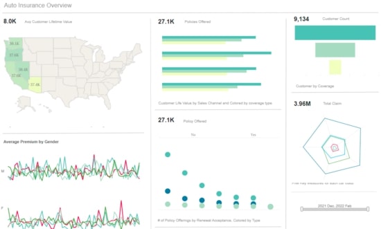
This Automated parameterized report keeps managers in the know while a robust toolset allows users to weave quantitative analysis, qualitative alerts, and predictive insurance analytics into a seamless process that can effectively increase revenue, control costs, and help to manage risk.
Steel Trade Dashboard
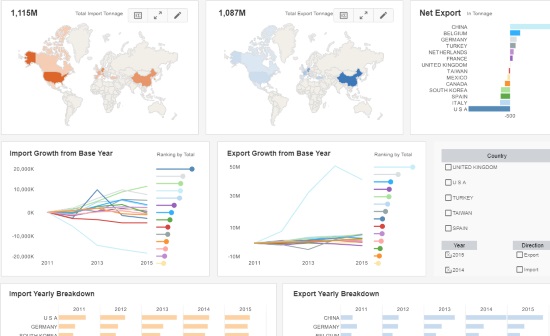
The Steel Trade Dashboard to the right is an example of an interactive web-based application for steel companies that InetSoft offers. With InetSoft's easy-to-use, drag-and-drop design, steel industry users can quickly build productive analytical tools like this one that aid in day-to-day operations, as well as help them keep track of and achieve long term goals and objectives.
As in all performance management software applications, visualization dashboards can be used to analyze specific details, accounts payable, sales, and other data. These dashboards are easy-to-use, interactive tools that could allow you to identify specific names, countries, and payees, if needed. Also, Auditors and accountants can "zoom in" or "zoom out" to spot outliers, compared to viewing 10,000 or more records in an XLS spreadsheet. Determining current rand and identifying outliers easily will lead to more efficient use of time, and help your company in the future.
With InetSoft's unique drag and drop dashboard design, you are able to fully customize reports geared toward your specific business. You have full control over with metrics and key performance indicators (KPI) that you wish to choose, and are able to combine and conform them to your growing business.
InetSoft's Dashboard Software
Are you looking for software tools to build performance dashboards? InetSoft offers free and commercial Web-based dashboard software that includes a drag and drop designer for creating impactful, interactive dashboards for enterprises and ISV's:
- For a free, no software to download option, try Visualize Free.
- For a free, downloadable version good for departmental use, try StyleBI Free Edition.
- For our full-featured commercial application which includes advanced data mashup and security options, evaluate StyleBI.


