About Visualizing Software
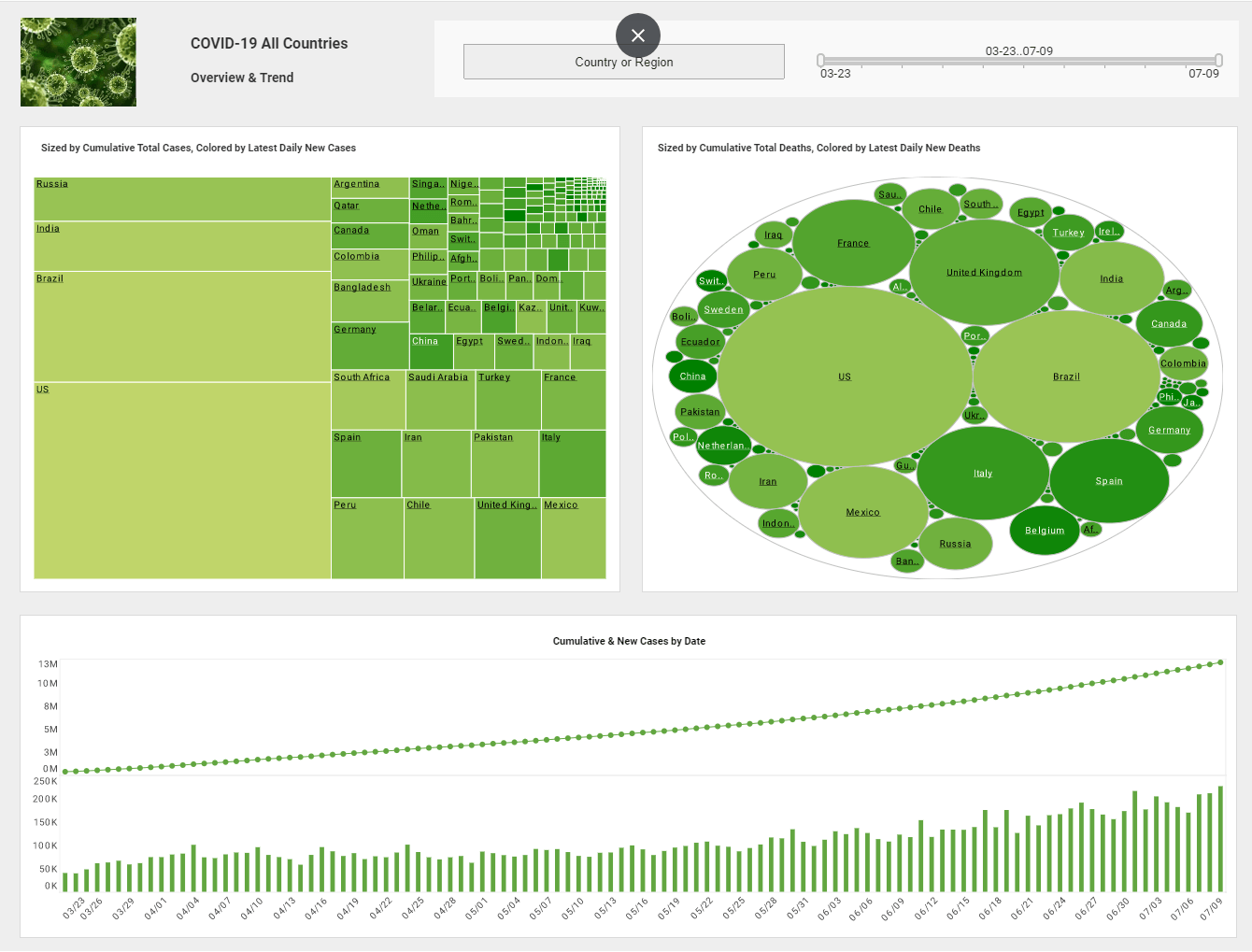
Visualizing software can capture data in any field, organize it, present it, and allow for thorough analysis. Data are the building blocks of any company. Data is seen in every field from bar codes in retail stores to users in online gaming. No matter where you are gathering your data from, it is meaningless without a way to organize and present it.
It has been proven that people comprehend data better through pictures than by reading number off of rows and columns. Visualizing software helps bring those boring rows and columns to life.
You are able to more effectively ask and answer important questions such as "How much has our revenue increased over the last quarter," "What percentage of our customers are shopping online," and "What is driving growth?" This ability to answers these very important questions turns your data into a competitive advantage instead of an underutilized asset.
| #1 Ranking: Read how InetSoft was rated #1 for user adoption in G2's user survey-based index | Read More |
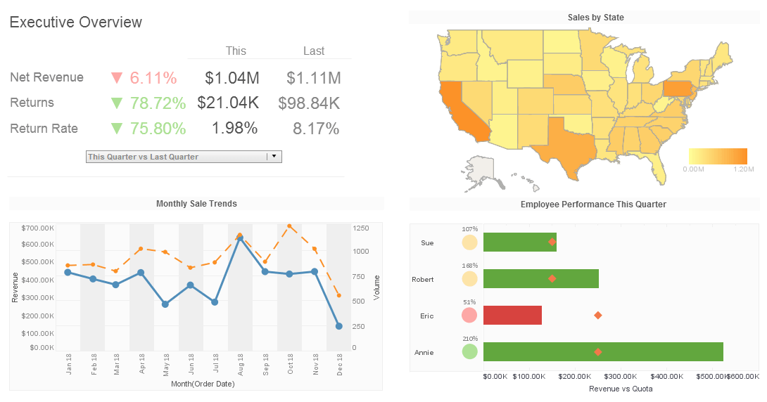
What Type of Data Are You Looking At?
- Revenue
- Office Expenses
- Year-To-Date Sales
- Employee Performance
- Inventory
What can Visualizing Software Do For Your Data?
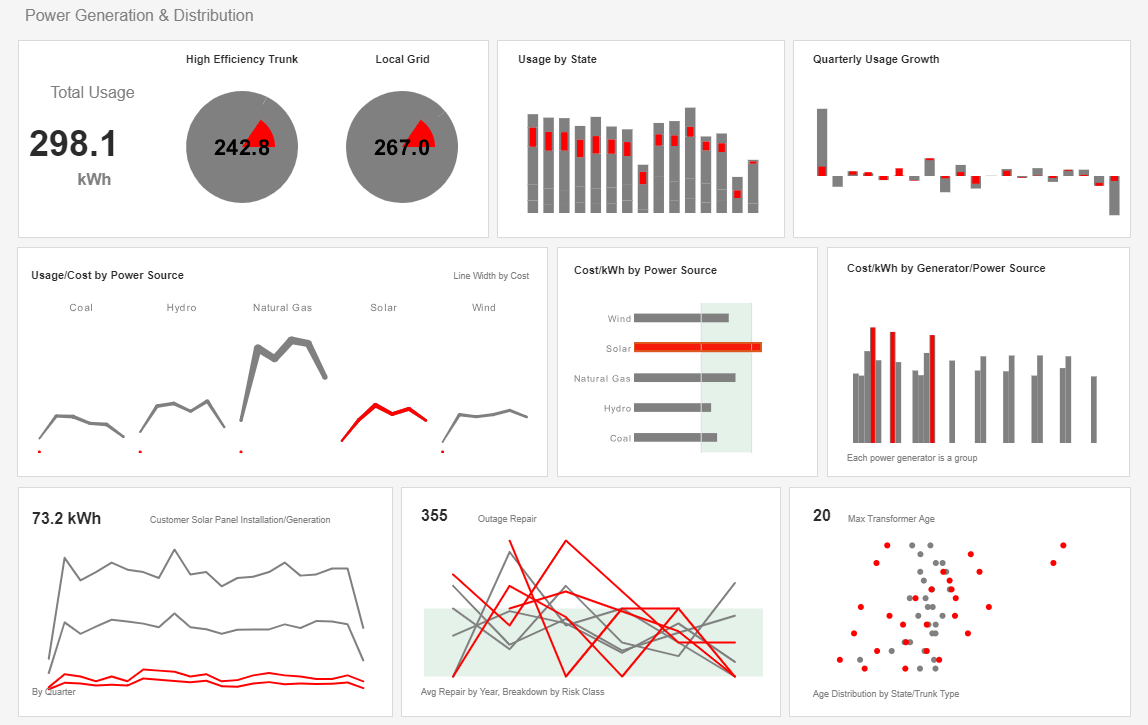
Expressive: a broad range of tools to tell any storyData visualization must be flexible enough for you to tell any story. Bar charts do not necessarily work for everything. When viewing visual representations of you data, you are rarely looking along a straight line. As you navigate between different perspectives, you will find the trend and outliers that are the most important.
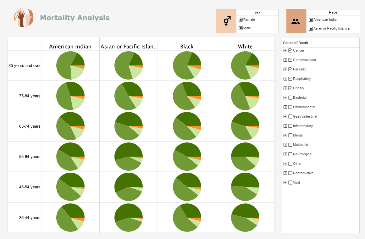
There are many ways to look at simple sales data. Different views answer different questions. Looking at data with a geographic element for example, brings in an entirely new dimension.
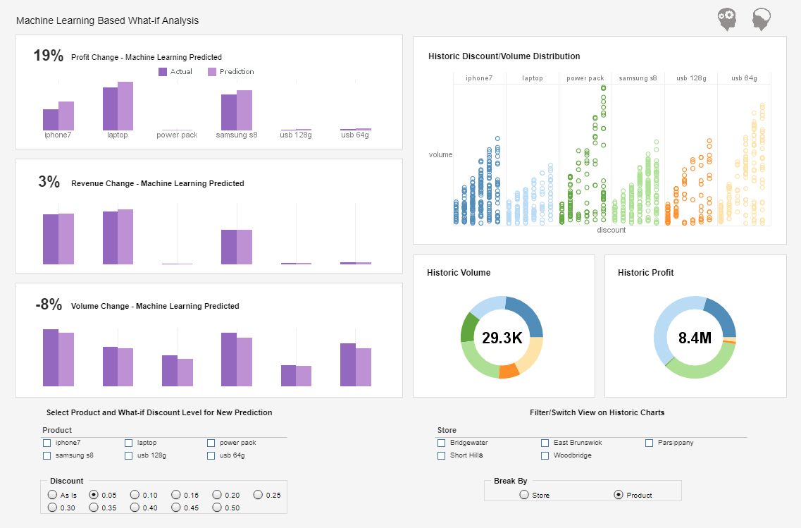
Interactive: interactivity supports visual thinkingThe cycle of visual analysis is a process of getting data, representing it one way, noticing results and asking follow on questions. The follow-on questions might lead to a need to drill down, drill up, filter, bring in new data, or create another view of your data. Without interactivity, the analyst is left with unanswered questions. With the right interactivity, the data visualization becomes a natural extension of the analyst's thought process.
Easy To Use: anyone can get questions answeredThe irony of most analysis tools is that the people who know the data and have questions don�t have the skills to use the tool to answer them, and the people who have the ability to use the tool don�t know the data. The result can be a frustrating, slow, back-and forth process to answer basic questions.
An easy-to-use interface breaks this pattern. By enabling anyone to answer their own questions without needing programming knowledge or specialized skills, the process of analyzing data gets much faster, easier and more insightful.
Visualization Tools: Why InetSoft?
InetSoft make visualization tools that are easy to deploy and easy to use, and when combined with their their unique data mashup capabilities, you given unified views of organizational performance and maximum self service.
InetSoft's small-footprint, Web-based application provides a streamlined, intuitive interface for all users. As an innovator in reporting software since 1996, InetSoft has pioneered the evolution from static reporting towards interactive visualization of data via dashboards.
Read what InetSoft customers and partners have said about their selection of Style Scope for their solution for dashboard reporting. |
