Best Data Dashboard Designs
Searching for the best dashboard designs? InetSoft provides many examples to learn from, demonstrating consistency across chart elements and pleasing color palettes.
Manufacturing KPIs

This manufacturing KPI dashboard is designed to provide an overview of production times, costs, and errors, displayed with a variety of charts and text kpis. The Produce Time by Product chart compares production times for each product to set benchmarks, helping managers to assess performance at-a-glance.
A radar chart displays a variety of product measures. Text KPI's in the top left corner give an at a glance picture of the factory's overall performance.
Accounts Receivable
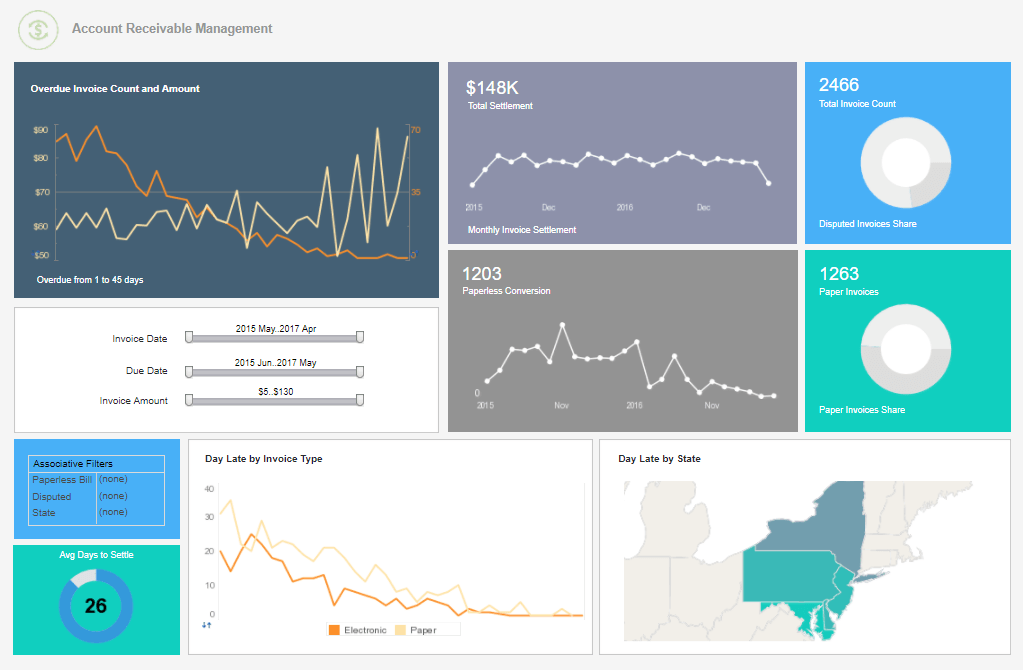
Accounting departments are challenged everyday with more reporting demands by executives, boards and external agencies. Visualization dashboards like the one above empower finance professionals with unprecedented self-service information and exploration. This, in turn, minimizes follow-up explanation otherwise needed by information consumers. This accounts receivable dashboard is designed to help company accountants keep track of money owed to the organization. Invoices are broken down by days late, with amounts settled each month tracked as well.
Service Operations
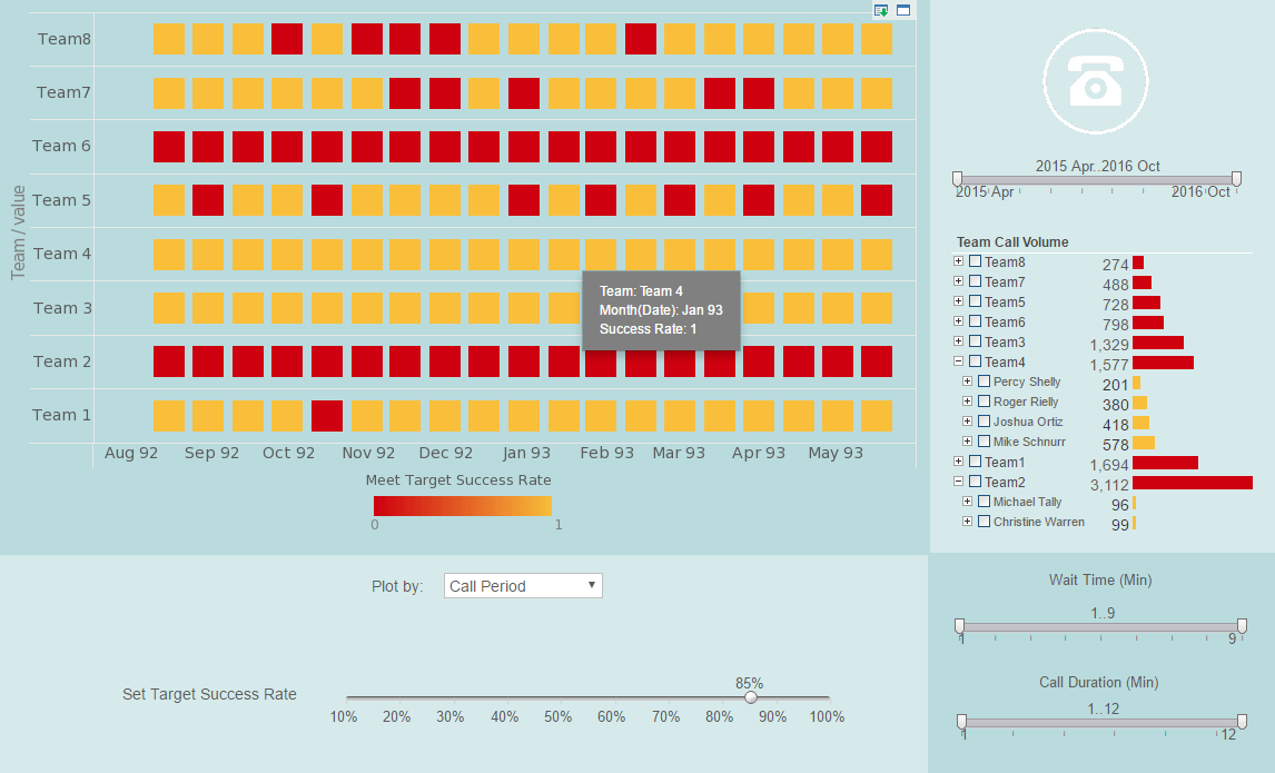
A customer service operations dashboard is a visual representation of key metrics and performance indicators related to customer service operations. It provides a consolidated view of important data and metrics, allowing customer service managers and teams to monitor and analyze the performance of their customer service activities. This service operations dashboard design makes it easier for call centers to manage their customer service teams. A red highlight shows when teams fall below goals on call period, call time, call status, and wait time. It can be customized to present specific metrics that are relevant to a particular organization's customer service goals and objectives.
Cohort Churn

A cohort analysis uses historical data to compare and examine user behavior by grouping users into cohorts based on behavioral similarities. This type of analysis gives insights into customer needs and improves market segmentation targeting
This cohort churn analysis displays what percentage of users spent a certain number of hours on a particular application.
Marketing Trends
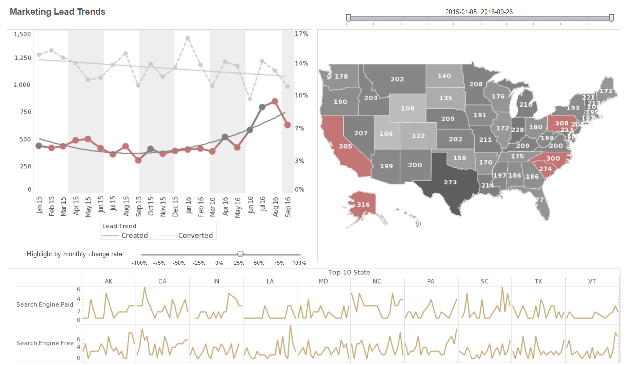
This marketing lead report displays important aspects of the sales funnel, by displaying leads by source, state and date. A slider below one of the line charts. Both top charts include a highlight feature based on monthly change rate, whose threshold can be adjusted using a slider which modifies the change rate that results in a chart highlight. This marketing metrics lead design provides an overall picture of new leads, their sources, and their conversion rates. The dashboard template gives an overall picture of new leads, their sources, and their conversion rates.
HR Metrics

This HR metrics dashboard is designed to help HR managers identify factors in employee attrition. Attrition data is broken down by gender, department, marital status, and years worked, helping to break down the various factors involved in personnel turnover. This HR metrics scorecard breaks down the various factors involved in personnel turnover, helping HR managers identify factors in employee attrition. HR metrics such as these help give HR managers an overall picture of the factors that contribute to employees leaving the company. A tree chart displays the proportional attrition rate among the different VP positions.
Heat Map Tool

A heat map is a visual representation of data that uses colors to indicate the relative values of the data points. A heat map displays a measure using a colored grid, where the value of the measure for a given combination of dimension values is used to determine the color of the grid at that location. Heat maps are often used to visualize data that has a spatial or geographical component, such as weather data, traffic patterns, or population density. In a heat map, each data point is represented by a colored square or rectangle, with the color indicating the intensity of the value being represented.
Supply Performance
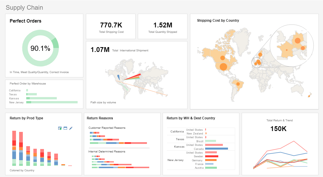
This supply chain performance example delivers the most important global shipping aggregates in one easy-to-read report,designed to give an overview of global shipments and returns. Charts detailing return by product type and reason help supply chain managers formulate strategy for reducing returns and increasing customer satisfaction. The dashboard also gives supply chain managers an overview of orders and returns. A made to order vs actual time chart helps ensure that expectations are being adequately met.
Profit Analysis
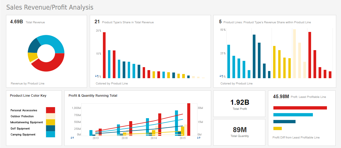
This CEO profits dashboard gives managers a complete overview of business activities. Various charts display revenue and profit, with the growth of various product lines displayed on an annual basis. This dashboard template can help a board of directors see what product lines have the greatest sales and profits. A map chart displays each country's share of global profits.
| Previous: Dashboard Design Inspiration |