BI Visualization Examples
Below are some BI visualization examples to give you a look at what is possible with Style Intelligence:
Bank Customer Segmentation
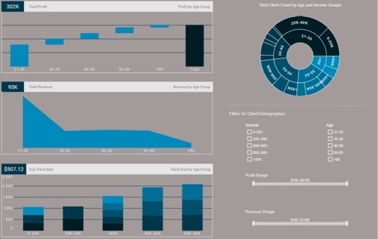
This interactive bank demographic report can help bank managers identify their most valuable customer demographics. The sunburst chart on the top right is an effective way to show how different customer segments relate to each other.
Sales Performance Visualization

This sales-by-state sales performance report gives a broad visual breakdown of revenue, prices, and profits, by product line. Color is used in several of the charts to add another dimension. The live version features a mouseover chart, packing in even more information without wasting dashboard real estate.
Help Center Visualization Portal

This real-time help center management portal gives shows call center managers how many calls their employees are handling and how long they are taking. The dashboard refreshes ever 30 seconds, with individual employees represented with icons that change color when the employee is on the phone.
SalesForce Visualization Example
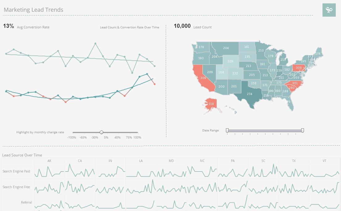
This SalesForce CRM marketing dashboard example gives marketing managers the metrics they need to monitor sales pipelines and optimize strategy. Lead count and source are tracked as well as conversion rates, with monthly change highlighted based on slider selection.
Loan Source Visualization
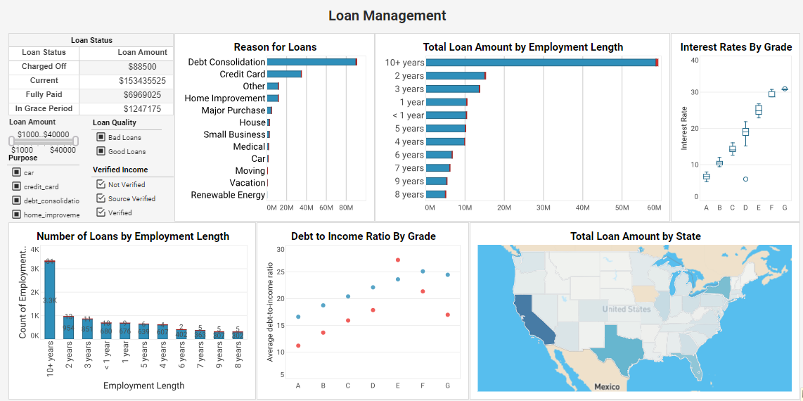
This lending assessment example is an indispensable solution that delves deep into loan attributes and borrower characteristics. By analyzing factors such as loan purpose, grade, employment length, debt-to-income ratio, and more, this dashboard equips lenders with data-driven insights that optimize loan strategies and ensure a seamless lending process.
Efficiency Optimization Visualization
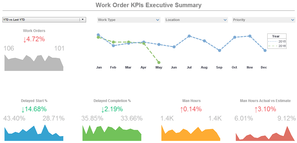
This operations work orders example displays the percentage of work orders started and completed, and tracks the man hours necessary for completion of said work orders. A number of line charts display the fluctuations in these various measures over time, enabling managers to pinpoint where specific issues occurred.
Executive Sales Visualization Overview
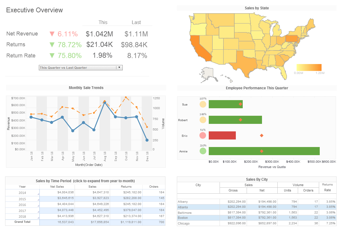
This executive sales overview gives executives an overview of sales by area, time period, and salesperson. The Employee Performance by Quarter chart displays employee sales relative to their quota, with bars turning red when performance lags behind the goal.
Risk Management Consultancy Visualization

This risk management consultancy dashboard from InetSoft partner Protecht displays various measures of risk and compliance. An incidents by date chart features a red line tracking actual losses, utilizing color to draw the users attention to what's most important.
Opportunity Outcome Visualization
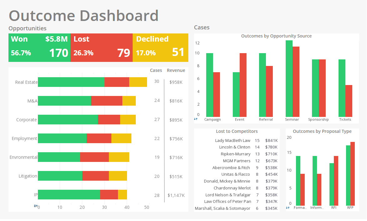
This win/loss opportunity outcome analyses wins and losses by category, opportunity source, and proposal type. With wins in green, losses in red, and declines in yellow, this dashboard is a great example of how our intuitive associations with different colors can be used to make a dashboard more communicative.
|
More: BI Visualization Samples
|