Business Visualization Examples
Below are some business visualization examples to give you a look at some of the advanced displays that can be created using Style Intelligence:
U.S Population Trends Visualization

This U.S. population trends by gender visualization illustrates how using only a few colors is often more communicative than a palette of many different shades. The dashboards charts are broken down by gender, with the traditional pink signifying female and blue signifying male. Using common color signifiers makes the dashboard easy to understand. The dashboard also features a chart with population broken down by region of the U.S.
Telecom Visualization

This visualization helps a telecom provider see the popularity and network utilization of different data plans, how the networks are varying in quality across different states, and track the general revenue provided by the different data plans. Several dropdown selectors offer the ability to change the binding on the dashboard charts, enabling more information to be explored in the same amount of space. A selection tree with hierarchical dimensions makes filtering the dashboard more efficient.
Cause of Death Visualization

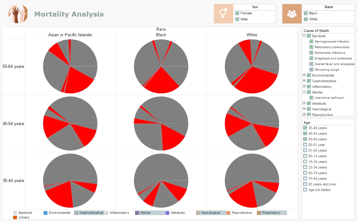
In this medical risk assessment visualization you can easily wring out a huge variety of statistics surrounding national mortality. The visuals can be displayed by age, race, gender or cause. You can filter out specific diseases within each Cause or zoom in for an intimate analysis within certain communities. Easily spot the major causes or drill down to find the way certain causes affect demographics differently. In this image we see brushing being used. A brushing highlights in red the object a user wants to dial into and focus on. The irrelevant information is washed out into gray and only the brushed information is visualized and can be interacted with. Brushing is not limited to a single measure or dimension, four in this arrangement have been put on display. We can visually aggregate their import and variety of import across age limits. When treating complex diseases that require multiple phases, different medications, and particular patient responses, brushing could be an invaluable tool for predictive analysis. By brushing a dashboard with multiple charts and KPI's the dashboard will be able to communicate how one change in treatment affects the rest of vital stats.
Product Sales Visualization

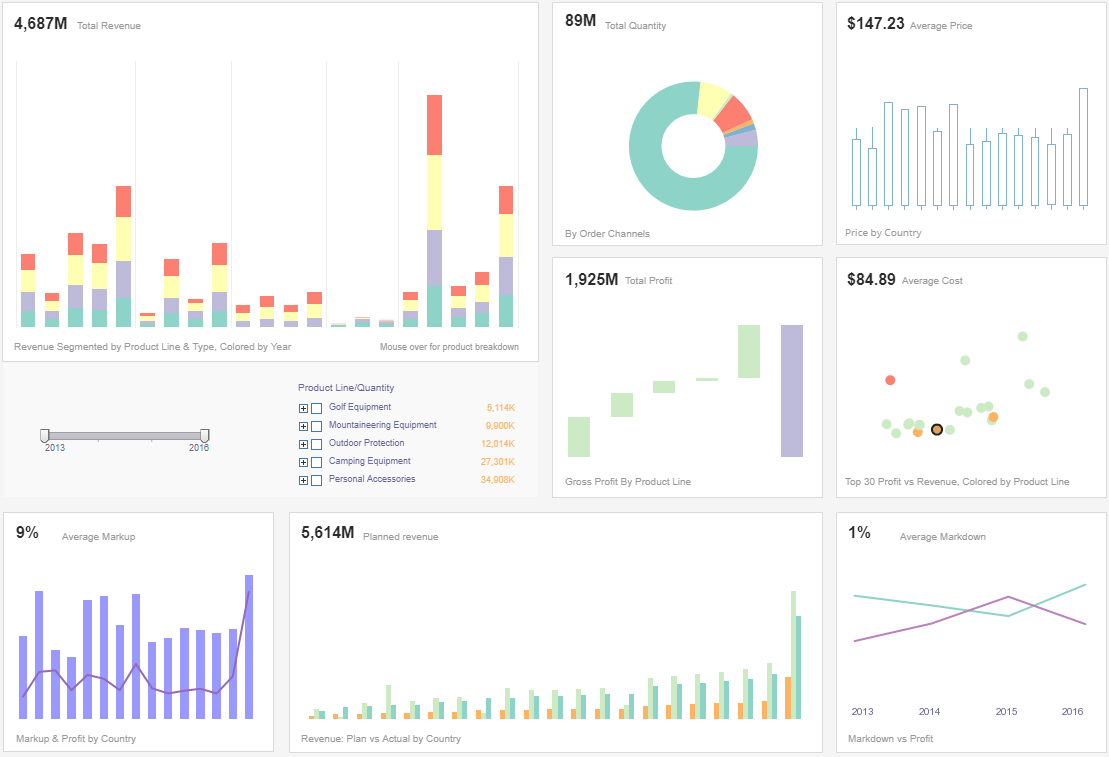
This sales performance visualization gives a high level overview to executives monitoring inventory and sales performance.
Profit and price are also detailed, covering basic accounting needs as well as sales. Color is used in several of the charts to add another dimension.
Chart types used throughout include a waterfall chart displaying profit by product line, and a candlestick chart showing average price.
Agriculture Visualization

The InetSoft Agricultural Analysis Visualization is designed to provide you with a comprehensive understanding of global agricultural production and crop yield in different nations. Our dashboard integrates a range of data, including crop types, national statistics, weather conditions, pesticide usage, yield data, and more, to empower you to make informed agricultural decisions. This InetSoft dashboard incorporates various visualization tools, such as tables, bar charts, line graphs, maps, and more, to assist you in gaining a better understanding of the data and its underlying insights. With the use of filters, it also helps you swiftly pinpoint your areas of interest, for example, countries, crop types, and years. There is no need for prior data analysis experience, making it a straightforward and user-friendly operation.
Pharmaceutical Testing Visualization

InetSoft's pharmaceutical testing visualization is an indispensable tool in pharmaceutical drug testing trials, providing a holistic view of trial data, enhancing decision-making, and contributing to the overall success and efficiency of drug development processes. The visualization provide a means to measure and evaluate the performance of drug testing trials. Researchers can assess the efficacy and safety of the drug candidate, monitor patient recruitment rates, track protocol adherence, and evaluate the overall progress of the trial. This information helps in optimizing trial design and resource allocation. InetSoft's mashup driven analytics assist in identifying and mitigating risks associated with drug testing trials. By analyzing historical data and ongoing trial metrics, researchers can anticipate potential challenges, such as patient dropout rates or unexpected side effects. Proactive risk management is crucial for maintaining the validity of the trial and ensuring regulatory compliance.
Online Food Delivery Visualization

This Online Food Delivery Visualization created using InetSoft's Style Scope caters to the requirements of food delivery app analysts who are looking to derive important insights that can help their business offer better service to their customers and generate higher revenue. The customer age distribution chart gives a comprehensive view of online food deliveries with regards to the age demographics of the customers. The demographics information presented by the chart assists the delivery app business in understanding the customer segments they need to target when deciding to run ads and offer discounts. The average customer review chart lets the delivery app provider keep a check on the underperforming restaurants, denoted by low average customer ratings. When combined with the restaurant complaints table, business users can pinpoint the exact issue faced by the customers of these underperforming restaurants. Analyzing customer feedback not only benefits the delivery app provider but also helps the partner restaurants improve their service.
Hotel Management Visualization

The hotel performance visualization embodies InetSoft's commitment to 'Intelligence With Style'. Beyond its sleek, user-friendly interface lies a powerful engine capable of processing multi-dimensional data, providing hotel managers with the foresight to anticipate hospitality market trends and guest needs. It's an essential tool for anyone in the hospitality industry looking to elevate their operational efficiency, enhance guest experiences, and drive profitability. In an industry where the margin for error is small, and the competition is intense, InetSoft's hotel performance dashboard stands as a crucial ally. It's more than just a dashboard; it's a gateway to understanding your hotel's story through data, a story that guides you to make informed, impactful decisions.