Dashboard Design Inspiration
Looking for inspiration for well-designed dashboard design ideas? Peruse these examples created with InetSoft's easy-to-use web dashboard software.
Commerce Analysis

This commerce analysis is an example of an interactive web-based application for steel companies that InetSoft offers. With InetSoft's easy-to-use, drag-and-drop design, steel industry users can quickly build productive analytical tools like this one that aid in day-to-day operations, as well as help them keep track of and achieve long term goals and objectives. This commerce reporting example paints a detailed picture of global imports and exports, with seven different charts, three of them multidimensional. With so many countries displayed, narrowing down the analysis with a selection checklist can make analysis exponentially easier for the end-user.
SCM Dashboard

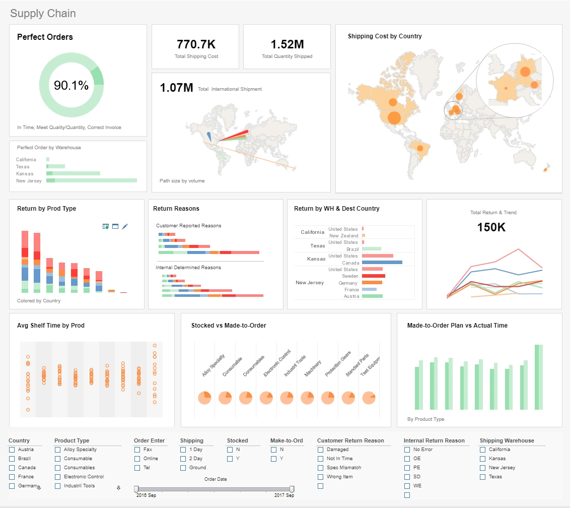
This supply chain management example delivers the most important global shipping aggregates in one easy-to-read report. A spotlight effect on one of the map charts highlights the location of some of the biggest shipment locations. This supply chain analysis example gives a global view of shipped orders. This view is aided by several map charts, one of which features a zoom in on key areas. Charts detailing return by product type and reason help supply chain managers formulate strategy for reducing returns and increasing customer satisfaction. A made to order vs actual time chart helps ensure that expectations are being adequately met.
Marketing Metrics

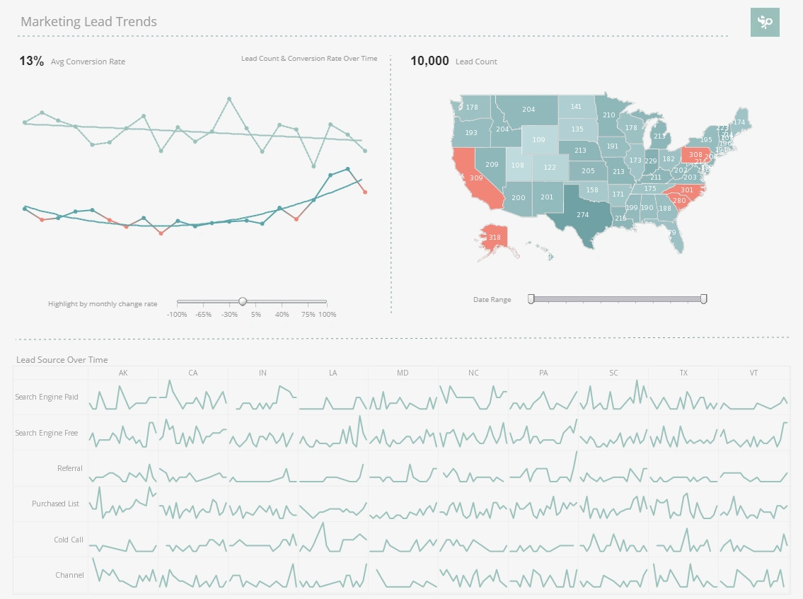
This marketing metrics lead report displays important aspects of the sales funnel, by displaying leads by source, state and date. Both top charts include a highlight feature based on monthly change rate. The dashboard template gives an overall picture of new leads, their sources, and their conversion rates. A slider below one of the line charts modifies the change rate that results in a chart highlight.
HR Management

This HR management scorecard breaks down the various factors involved in personnel turnover, helping HR managers identify factors in employee attrition. Attrition data is broken down by gender, department, marital status, and years worked. HR scorecards help give HR managers an overall picture of the factors that contribute to employees leaving the company. This dashboard helps give HR managers an overall picture of the factors that contribute to employees leaving the company. A tree chart displays the proportional attrition rate among the different VP positions.
Insurance Company

This automated insurance company report keeps managers in the know while a robust toolset, allowing users to weave quantitative analysis, qualitative alerts, and predictive insurance analytics into a seamless process that can effectively increase revenue, control costs, and help to manage risk.
CEO Performance

This CEO performance dashboard gives managers a complete overview of business activities. Various charts display revenue and profit, with the growth of various product lines displayed on an annual basis. This dashboard template can help a board of directors see what product lines have the greatest sales and profits. A map chart displays each country's share of global profits.
Heat Map Data

A heat map is a visual representation of data that uses colors to indicate the relative values of the data points. A heat map displays a measure using a colored grid, where the value of the measure for a given combination of dimension values is used to determine the color of the grid at that location. Heat maps are often used to visualize data that has a spatial or geographical component, such as weather data, traffic patterns, or population density. In a heat map, each data point is represented by a colored square or rectangle, with the color indicating the intensity of the value being represented.
Supply Chain KPI

This supply chain KPI reporting example delivers the most important global shipping aggregates in one easy-to-read report. This supply chain dashboard gives an overview of global shipments and returns. Charts detailing return by product type and reason help supply chain managers formulate strategy for reducing returns and increasing customer satisfaction. The dashboard also gives supply chain managers an overview of orders and returns. A made to order vs actual time chart helps ensure that expectations are being adequately met.
Power Generation

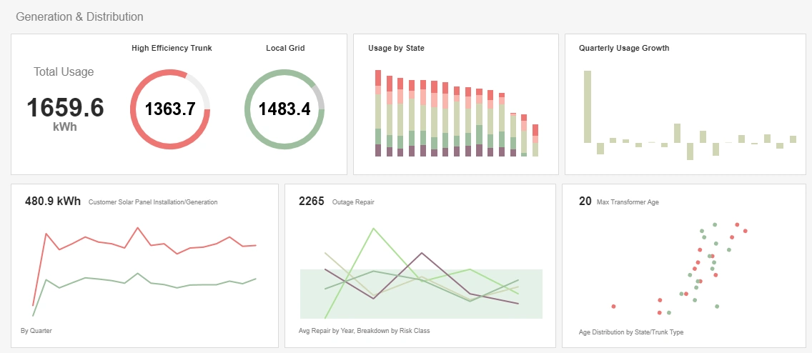
This power generation report gives updates on power usage as well as various maintenance priorities that concern anyone maintaining a power grid. Color is used to visualize extra dimensions throughout, enabling more to be reported on less charts. Usage is tracked by state and power source, with outages and transformers monitored as well.