Dashboard Ideas
Below are some dashboard ideas to give you inspiration for what your business can do with Style Intelligence:
Visual Analysis

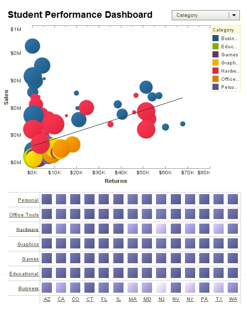
This visual sales analysis gives a VP a high level view of sales and also product returns. By incorporating product type as color and return rate as size, the main chart highlights the utility of multidimensional charting, enabling the viewer to notice complex correlations of 4 different data fields.
Visual Report

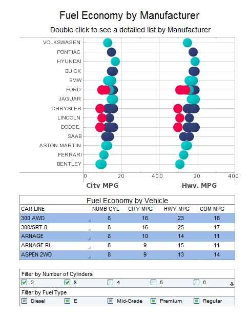
This visual automotive report displays the fuel efficiency of various vehicles which are organized along a number of variables. While average mpg is displayed with position, color is also used to display the number of cylinders in a vehicles' engine. A large selection list provides easy interactivity on a touch screen. The dashboard also features a table displaying individual vehicle stats, facilitating drilldown to explore outliers.
Marketing Dashboard

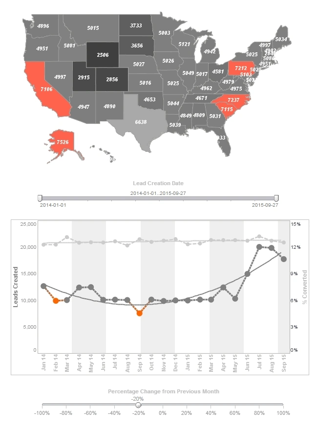
This marketing campaign dashboard displays important aspects of the sales funnel, by displaying leads by source, state and date. Both top charts include a highlight feature based on monthly change rate, whose threshold can be adjusted using a slider which modifies the change rate that results in a chart highlight. The dashboard template gives an overall picture of new leads, their sources, and their conversion rates.
Education KPI Dashboard

This education KPI dashboard breaks down admissions by various demographic and psychographic factors, such as race, gender, major type, transfers, and year. Large, easy to read text KPIs display the dashboard's most important aggregates, with percent change from previous period displayed underneath them.
Manufacturing Quality Dashboard

This manufacturing dashboard gives foremen a high level view of projects, costs and revenue, and worker safety. This dashboard gives property developers an overview of construction projects, including costs, timeliness, and worker safety. Drilldown buttons on the Revenue by Quarter chart enables the user to pinpoint periods of high and low activity.
Law Enforcement Casualty Minimization

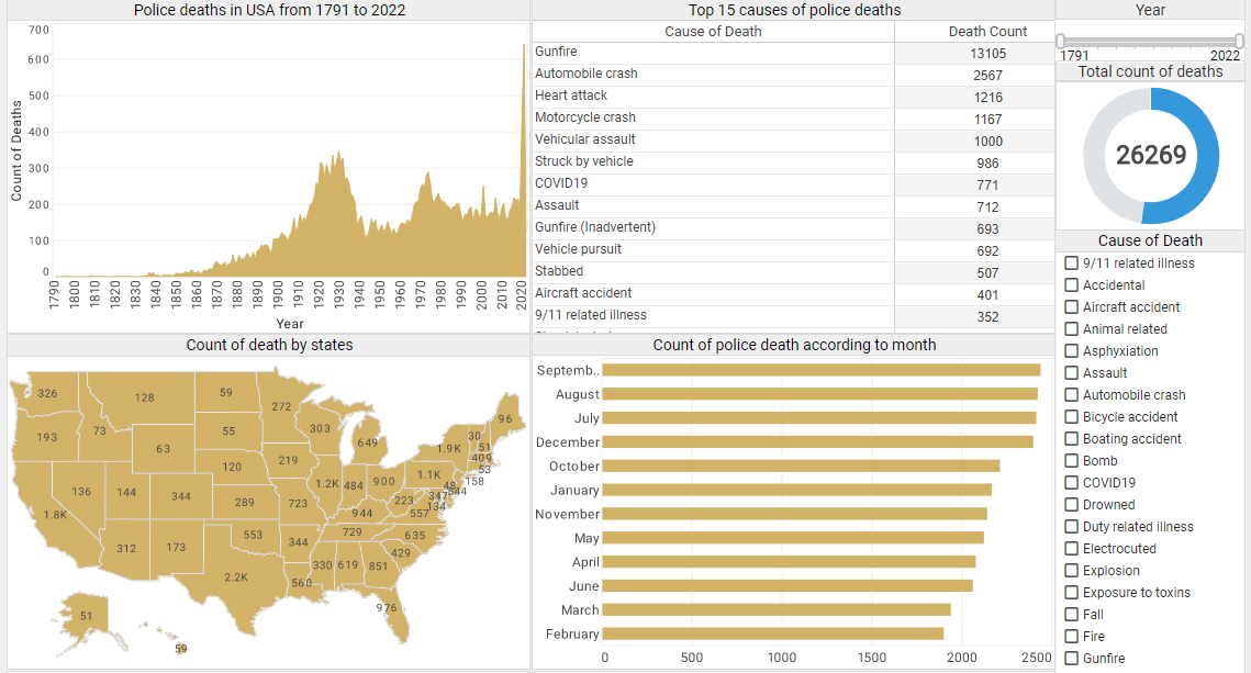
This interactive law enforcement dashboard displays police fatality data since 1791, across 17,985 police departments in the United States. The visualization's charts and tables let users comprehend these vast amounts of data at a glance in a more efficient way. The dashboard also incorporates several tables to allow users to dive deep into more details. The tables list the top 15 death causes, the top 15 types of police officers in the most danger, and the top 15 departments with the most police deaths, providing details of police deaths that are the most relevant to analyze from an abundant amount of data.
Credit Approval Visualization

This credit card approval dashboard investigates several factors associated with credit card approvals, including income, debt, age, ethnicity, credit score, marriage status, and gender. It not only allows financial users to visualize the relationship between a single factor and credit card approval rates at a glance, it also helps users slice and dice relationships easily between different variables with built-in checklists and sliders. Through the intuitive charts and filter functions on this credit card approval analytics dashboard, financial professionals can be more accurate in constructing credit card customer personas, understanding how different factors interact and affect the credit card approval rate.
Bog Iron Extraction

Industrial operators face complex, interdependent factors when planning bog iron extraction projects: ore quality varies with depth and location, seasonal water table shifts affect excavation schedules, and the logistics of hauling and processing heavy materials must be balanced against safety and environmental compliance. This dashboard aggregates live sensor feeds, historical assay results, and transportation metrics into a single pane of glass suitable for shift supervisors and operations managers. Interactive maps highlight current excavation zones and allow quick toggling between strata layers to visualize ore concentration versus moisture content. Timelines and forecast modules use rolling averages to estimate recovery rates under different equipment allocations, while KPI tiles summarize cost per ton, average throughput, and incident frequency. By blending predictive maintenance signals with production KPIs, the dashboard helps teams prioritize machine repairs that would otherwise cause downstream bottlenecks. Managers can drill down from high-level weekly trends into per-shift logs to analyze the effects of crew composition and weather on productivity, enabling informed resource reallocation that reduces downtime and improves yield.
Emergency Room Dashboard

Emergency departments must make split-second decisions while juggling limited beds, fluctuating staff levels, and a constant stream of incoming cases with varying acuity. This dashboard presents a concise operational view designed for charge nurses and departmental leaders: live triage queues are color-coded by priority and expected wait time, while bed occupancy visualizations show real-time capacity across treatment zones. A separate panel tracks staff availability, skill mix, and shift overlap, enabling managers to reassign or call in supplemental personnel based on projected patient surges. Integrated hospital-wide telemetry signals highlight resource constraints elsewhere in the system (e.g., imaging or ICU queues) so the ED can anticipate delays and activate diversion protocols when necessary. Predictive analytics estimate expected arrivals in the next hour using time-of-day and local event data, helping teams pre-position staff and equipment; meanwhile outcome indicators like door-to-provider time and left-without-being-seen rates are displayed as trend lines to measure process improvement efforts. The dashboard's drilldowns allow clinical leads to identify bottlenecks and test targeted interventions to improve throughput and patient safety.
Financial Advisor Dashboard

We built this financial advisor dashboard to surface meaningful portfolio insights in a compact, action-oriented display suitable for client meetings and advisor decision support. The dashboard aggregates positions, attribution, risk, and cashflow projections while correlating them to client goals and constraints. At the top, KPI tiles show net worth, aggregated return, 12-month volatility and liquidity buffers; below, an interactive asset allocation chart lets advisors reweight portfolios and see immediate pro forma impacts on projected returns and downside risk. A performance attribution panel decomposes returns by market, sector, and security to help explain why a portfolio outperformed or underperformed its benchmark. Scenario modeling tools simulate shocks—rate moves, equity drawdowns, or currency shifts—and provide probability-weighted outcomes so advisors can demonstrate robust or fragile allocations to clients. Integrated compliance flags highlight any concentration or policy breaches, while scheduled event markers (capital calls, dividend dates) are surfaced to reduce operational surprises. Finally, client notes and recommended actions are preserved alongside the analytics, creating a single record to support informed, timely advice.
Global Network Performance

Network operations teams rely on this global network performance dashboard to monitor the health and throughput of distributed infrastructure in real time. The dashboard consolidates latency, packet loss, throughput, and error rates from every regional point-of-presence into an at-a-glance world map and regional rollups, allowing engineers to quickly see where traffic is degraded. Time-series panels show trend lines for mean latency and tail latencies by region, while a capacity planning module projects saturation points using historical growth rates. Alerting integrates with incident management so anomalous spikes automatically create tickets with the relevant telemetry attached. Drilldowns allow operators to inspect routing (BGP) anomalies, interface errors, and per-host metrics that surface noisy or failing devices. The dashboard also supports synthetic transaction testing and SLA dashboards for enterprise customers, giving both ops and account teams a unified view to prioritize remediation and communicate impact during incidents.