Dashboard Visualizations
Below are some dashboard visualizations to give you an idea of some of the unique possibilities can be explored using Style Intelligence. Each visualization was designed for a particular industry, department, or field of study. InetSoft's visualization designer is a user friendly, drag and drop interface, no Python or SQL necessary.
CRM Visualization Dashboard

This visualization enables a sales manager to keep track of how her department is keeping up with current leads, and also helps pinpoint which leads need to be contacted again. Leads can be filtered by date modified, status, amount of touches, and by account name. A calendar selector makes it very easy to compare leads by date. The dashboard also features a search bar, allowing the status of individual leads to be researched.
Enrollment Visualization
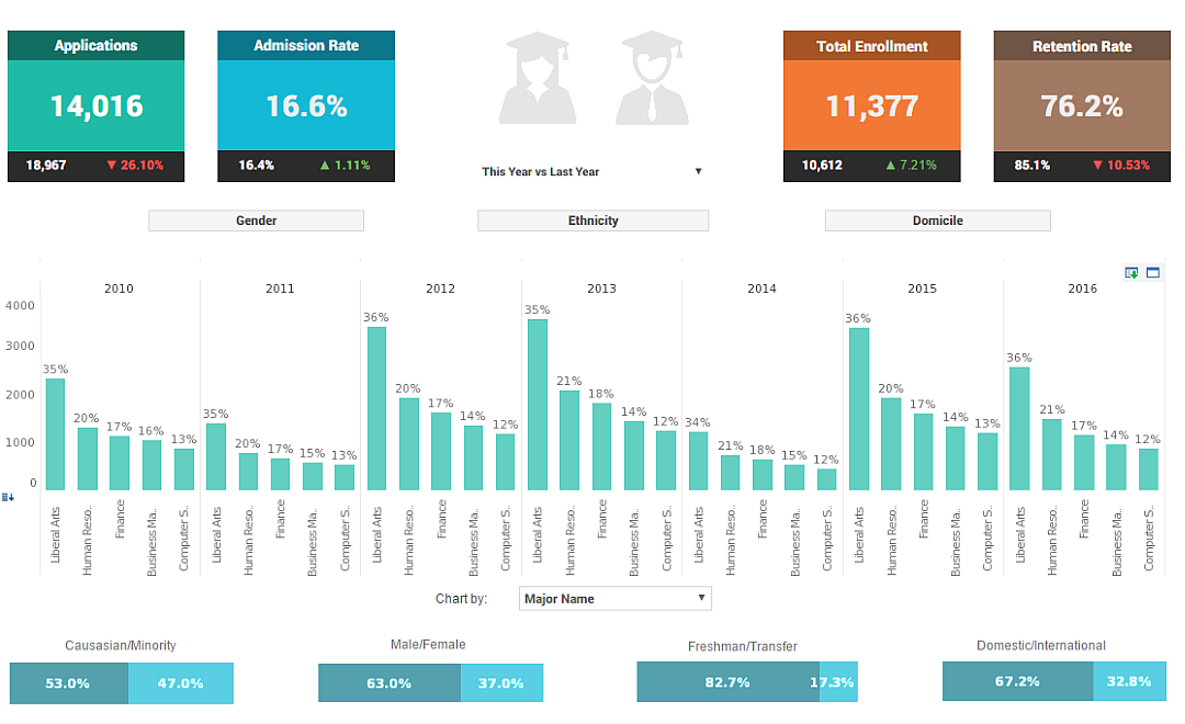
This visualization shows a school administrator what the progression of major choices has been over the past several years, and breaks down the student population into various demographics, including race, gender, and other categories. Large, easy to read text KPIs display the dashboard's most important aggregates, with percent change from previous period displayed underneath them.
Census Visualization
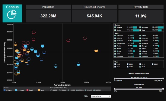
This visual exploration of United States census data demonstrates the flexibility offered by multidimensional charting. In addition to population and median income on the x and y axes, region and property value are displayed using color and fill. A dropdown selector gives the option to fill circles based on other measures.
Risk Management Visualization

This executive risk management visualization from InetSoft partner Protecht displays various measures of risk and compliance. An incidents by date chart features a red line tracking actual losses, utilizing color to draw the users attention to what's most important. A section of open actions lets the CEO viewing the dashboard know what further steps need to be taken.
Personal Loans Visualization
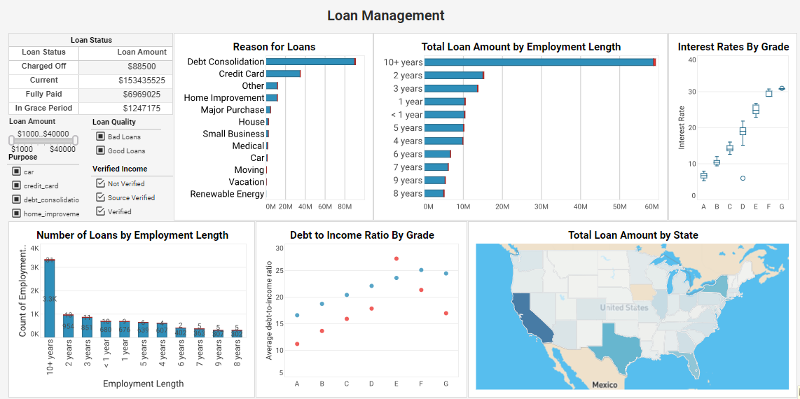
This personal loans visualization example is an indispensable solution that delves deep into loan attributes and borrower characteristics. By analyzing factors such as loan purpose, grade, employment length, debt-to-income ratio, and more, this dashboard equips lenders with data-driven insights that optimize loan strategies and ensure a seamless lending process. A map chart displays which states have the highest amounts borrowed.
Productiion Visualization
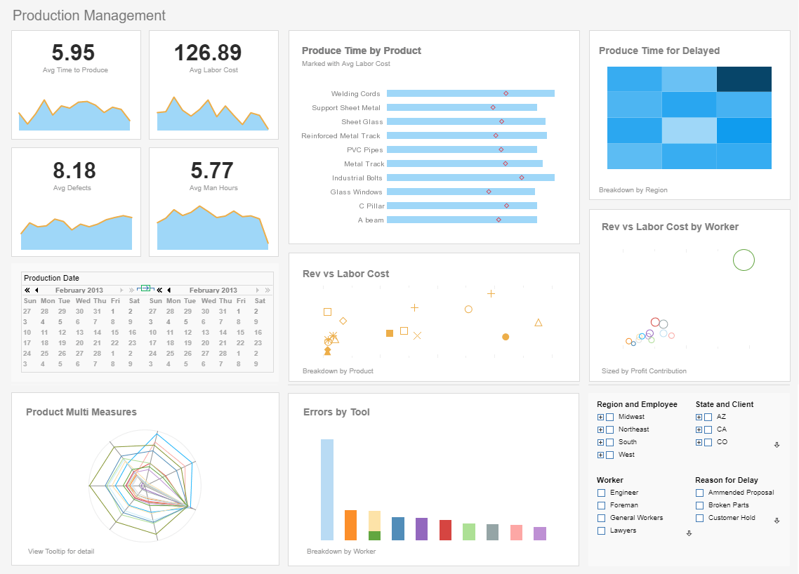
Using performance data and metrics within a company, this production performance visualization measures production efficiency, enabling shop managers to meet their deadlines with ease. The dashboard graphically represents the status of each phase of the manufacturing process, provides managers with great insight to act accordingly and make decisions in a confident manner.
Law Firm Visualization
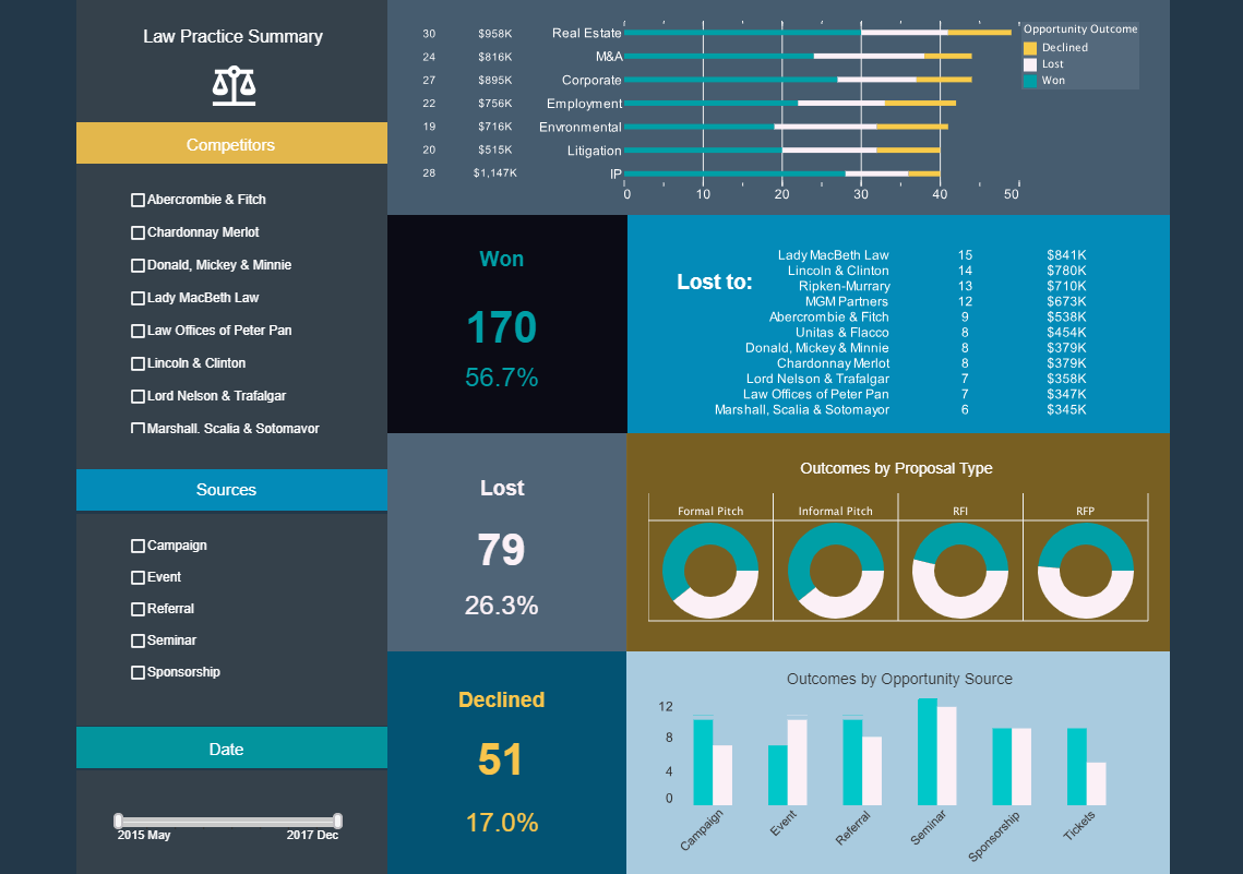
This legal services visualization tracks wins and losses with large, easy to read KPIs, as well as breaking down said wins and losses with various charts. The template could also be used as a CRM dashboard, tracking lost and won opportunities by type.
Large text KPIs of total wins and losses give an overall view of performance to busy executives.
Finance Customer Visualization
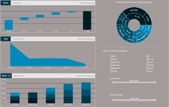
This finance customer visualization gives banking executives a high level view of their customer demographics. Profit and revenue are broken down by age and income, giving executives a picture of their most valuable customer segments.
A sunburst chart shows the proportion of each income bracket within the various age ranges.
Insurance Claims Visualization
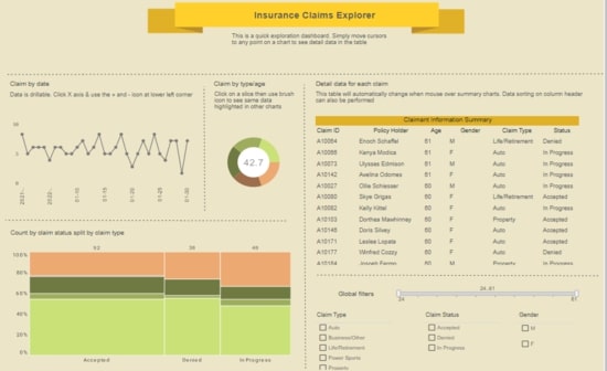
This claims analytics dashboard helps insurance adjusters better estimate insurer risk by enabling them to explore what type of claims are coming from what people, and see the results of those claims. Breakdowns of claims by age, date, and status give a high level view of risks and payouts. The dashboard shows how having a muted background color can be easier on the eyes than having elements against a white background. The dashboard's charts also use muted colors so as to not clash with the background.
Power Management Visualization
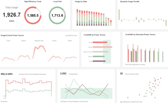
This power management visualization is helpful in managing all aspects of a power grid. Usage is tracked by state and power source, with outages and transformers monitored as well.
Important KPIs are displayed as large numbered guages, to provide an at a glance overview of power usage. A bar chart showing change from previous quarter helps highlight overall trends.
Instagram Accounts Visualization
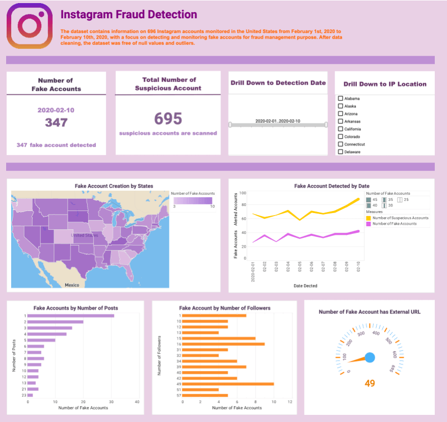
This Instagram fake account detection visualization makes use of dynamic text, which is text that is hooked up to data sources and updates automatically as new data becomes available. By tracking fake accounts by the number of followers or posts, fraud management teams can gain insights into the potential impact of these accounts on their social media platforms
Customer Churn Visualization

A cohort analysis uses historical data to compare and examine user behavior by grouping users into cohorts based on behavioral similarities. This type of analysis gives insights into customer needs and improves market segmentation targeting.
This cohort churn analysis visualization example displays what percentage of users spent a certain number of hours on a particular application. A selection list enables the user to narrow down the number of applications displayed, enabling more in-depth comparisons to be made.
HR Attrition Management Visualization
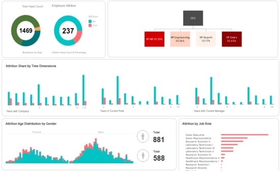
This human resources visualization helps HR managers identify factors in employee attrition. Attrition data is broken down by gender, department, marital status, and years worked. A treemap chart breaks down attrition among senior job roles.
Customer Service Visualization
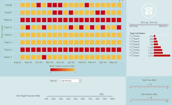
This customer service visualization makes it easier for call centers to manage their customer service teams. A red highlight shows when teams fall below goals on call period, call time, call status, and wait time. The dashboard also features a slider which adjusts the threshold for the red highlight.
Pandemic Tracking Visualization

This pandemic tracking visualization shows how using a contrasting color can be used to draw attention to certain data points. Whereas most of the states are colored varying shades of green, the top states for COVID cases are colored orange, and the state with the highest cases colored red. Once again, the the use of traditional color signifiers (red signifying something unwanted) makes the dashboard easy to understand.
Want to try building an InetSoft dashboard yourself? Sign up for our free test drive, no download required.
| Previous: Business Visualization Samples |