Key Performance Indicators Examples
Below are key performance indicators examples displayed in dashboards designed using InetSoft's drag and drop dashboard solution, some of which can be tested with the free downloadable evaluation copy of Style Intelligence, while others can be seen in the free visualization tool, Visualize Free.
Customer Service

This live customer service dashboard gives shows call center managers how many calls their employees are handling and how long they are taking.
The dashboard refreshes ever 30 seconds, with individual employees represented with icons that change color when the employee is on the phone.
Marketing Campaigns

This marketing campaign analysis displays important aspects of the sales funnel, by displaying leads by source, state and date. Both top charts include a highlight feature based on monthly change rate, whose threshold can be adjusted using a slider which modifies the change rate that results in a chart highlight. The dashboard template gives an overall picture of new leads, their sources, and their conversion rates.
Worker Safety

This worker safety dashboard gives foremen a high level view of projects, costs and revenue, and worker safety. This dashboard gives property developers an overview of construction projects, including costs, timeliness, and worker safety. Drilldown buttons on the Revenue by Quarter chart enables the user to pinpoint periods of high and low activity.
University Enrollment

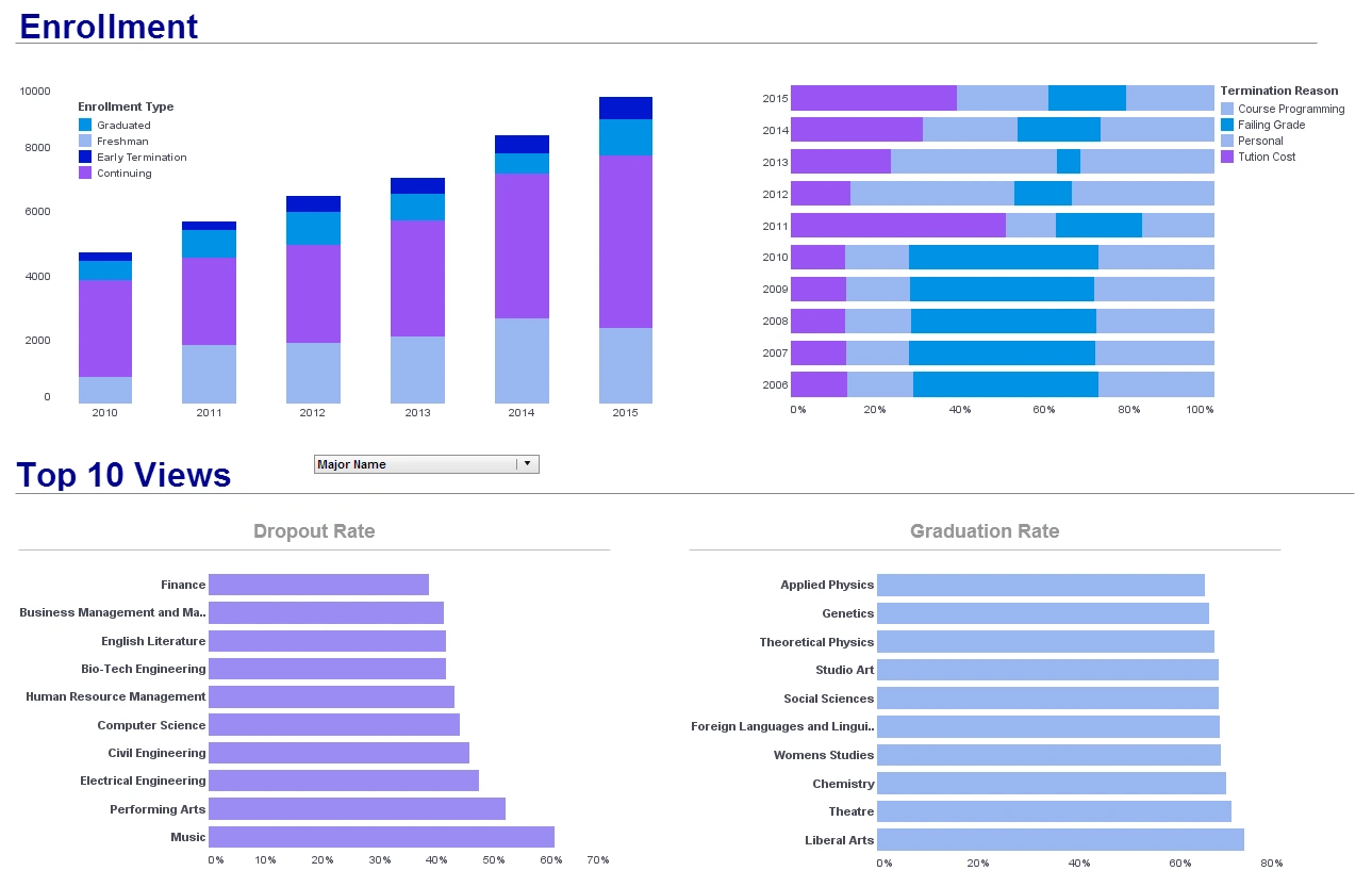
This university enrollment analysis breaks down admissions by various demographic and psychographic factors, such as race, gender, major type, transfers, and year.
Large, easy to read text KPIs display the dashboard's most important aggregates, with percent change from previous period displayed underneath them.
Lead Creation

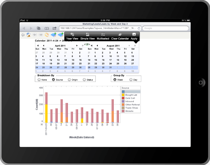
This lead creation dashboard displays leads by week, source, status, and origin.
A calendar selector enenables any weeks to be selected.
Manufacturing Performance

This manufacturing KPI dashboard is designed to provide an overview of production times, costs, and errors, displayed with a variety of charts and text kpis. The Produce Time by Product chart compares production times for each product to set benchmarks, helping managers to assess performance at-a-glance. A radar chart displays a variety of product measures. Text KPI's in the top left corner give an at a glance picture of the factory's overall performance.
