Online Metrics Dashboard Examples
Online metrics dashboards are revolutionizing business, as they bring the benefits of metrics dashboards to users wherever they are. Now executives can monitor performance and predict trends when working from home, or even on their phone while they're taking the subway. Below are online metrics dashboard examples designed using InetSoft's data mashup driven web app, Style Intelligence. These dashboards focus on key metrics.
NGO - Not for Profit
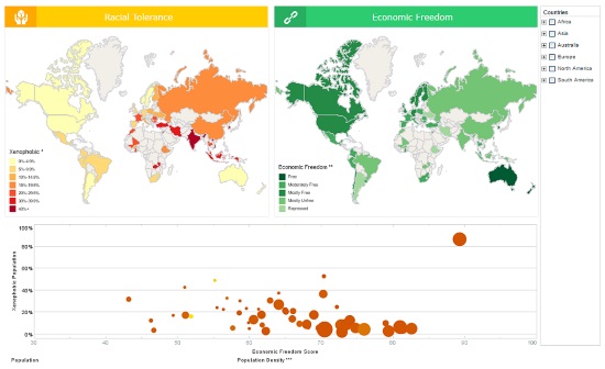
This dashboard helps NGOs analyze factors affecting intolerance, by comparing racial intolerance with economic freedom. Population and population density are also visualized, bringing more nuance into the analysis.
Human Resources
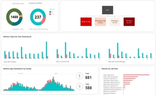
This human resources dashboard helps HR managers identify factors in employee attrition. Attrition data is broken down by gender, department, marital status, and years worked.
Tech Support
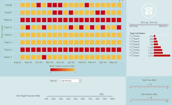
This tech support dashboard makes it easier for call centers to manage their customer service teams. A red highlight shows when teams fall below goals on call period, call time, call status, and wait time.
Accounts Receivable
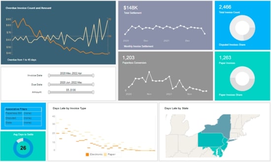
This accounts receivable dashboard helps company accountants keep track of money owed to the organization. Invoices are broken down by days late, with amounts settled each month tracked as well.
Service Operations
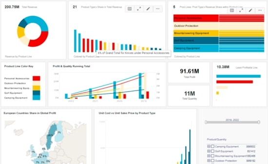
This service operations dashboard gives managers a complete overview of business activities. Various charts display revenue and profit, with the growth of various product lines displayed on an annual basis.
Power Management
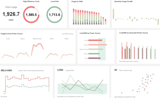
This power management dashboard is helpful in managing all aspects of a power grid. Usage is tracked by state and power source, with outages and transformers monitored as well.
Spatial Analysis
![]()
This spatial analysis tracks hurricanes over a thirty year period. The twin map charts make it easy to compare different years.
Machine Operations
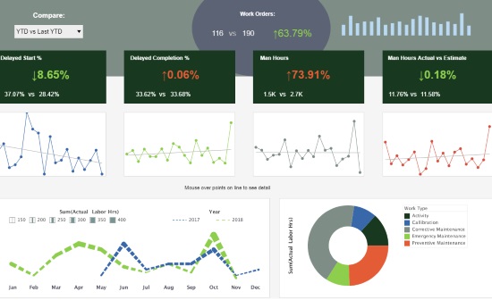
This machine operations dashboard example gives a high level view of all maintenance being performed. Delays are tracked, enabling managers to monitor the timeliness of their workforce.
Data Exploration
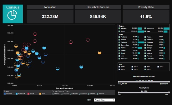
This data exploration of US census data uses multidimensional charting to display population, income, region, and property value, all in a single chart. Various filter elements enable possible patterns in the data to be discovered and explored.
Financial Management
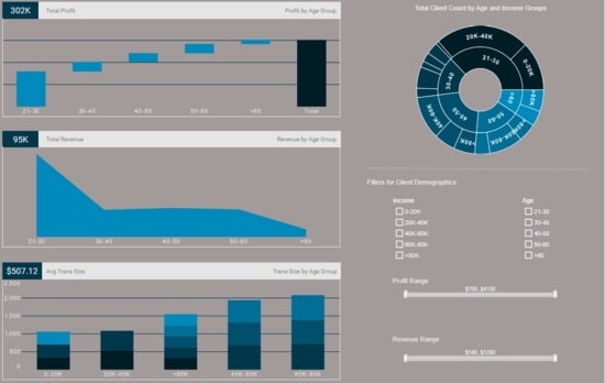
This financial management dashboard gives banking executives a high level view of their customer demographics. Profit and revenue are broken down by age and income, giving executives a picture of their most valuable customer segments.
Claims Analytics
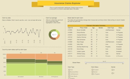
This claims analytics dashboard helps insurance adjusters better estimate insurer risk. Breakdowns of claims by age, date, and status give a high level view of risks and payouts.
Performance Analysis
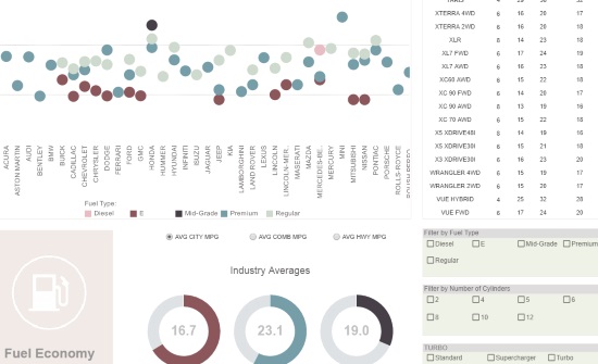
This performance analysis displays the fuel efficiency of various automobiles. Fuel type displayed using color helps add context to the comparison of different vehicle types.
| Previous: Executive Dashboard Examples |