Sample BI Dashboards
Below are sample dashboards built with InetSoft's Java-based dashboard application, Style Intelligence. Explore further with the free 5-day self evaluation.
Call Center Monitoring
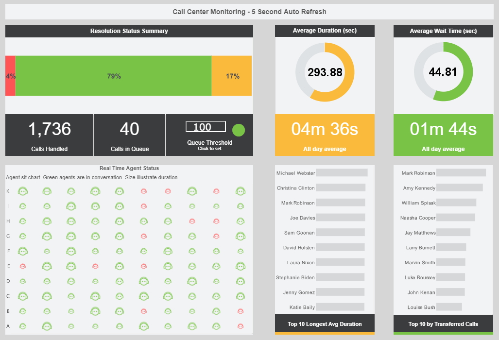
This live customer service dashboard gives shows call center managers how many calls their employees are handling and how long they are taking.
The dashboard refreshes ever 30 seconds, with individual employees represented with icons that change color when the employee is on the phone.
Fraud Management
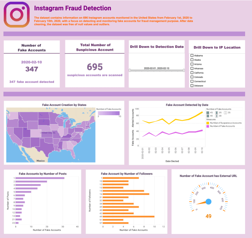
InetSoft's fraud management dashboard makes use of dynamic text, which is text that is hooked up to data sources and updates automatically as new data becomes available.
By tracking fake accounts by the number of followers or posts, fraud management teams can gain insights into the potential impact of these accounts on their social media platforms.
Social Media Marketing Dashboard

This social media marketing dashboard can free business users from juggling multiple social media accounts across various platforms, and allow them to monitor accounts and track engagement metrics all in one place.
The dashboard consists of a combination of easy-to-understand charts such as summary charts, line charts, bar charts, and pie charts to present engagement information across multiple platforms, and uses interactive filters to simplify the process of making analysis and comparisons.
Claims Analytics
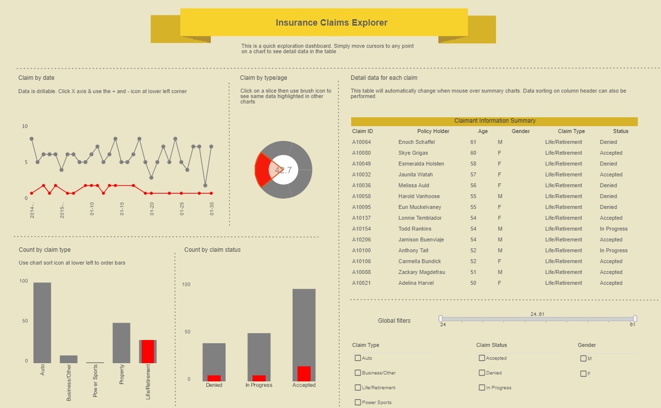
This insurance analytics example gives an overview of insurance claims by type, date, and status.
A section of the claim by type/age chart has been brushed, resulting in its proportion being highlighted on all the other charts.
Healthcare Informatics
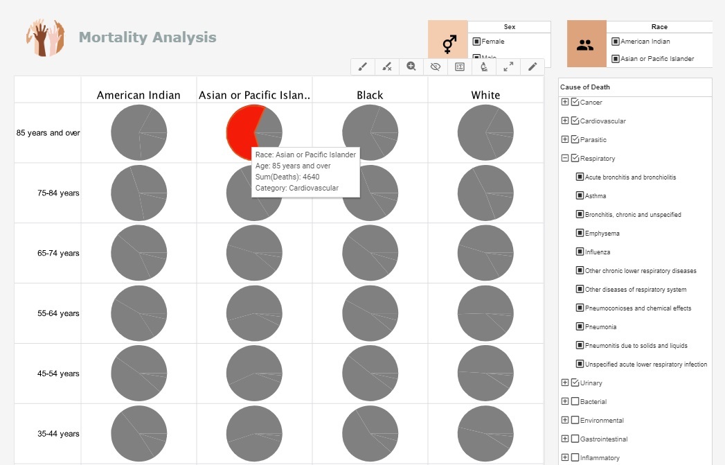
This health analysis breaks down mortality causes along a variety of demographics categories, including, race, age, and sex.
This type of analytics can help healthcare providers asses patient risk for various ailments and adjust care accordingly.
Credit Card Approvals

This credit dashboard that investigates several factors associated with credit card approvals, including income, debt, age, ethnicity, credit score, marriage status, and gender. It not only allows financial users to visualize the relationship between a single factor and credit card approval rates at a glance, it also helps users slice and dice relationships easily between different variables with built-in checklists and sliders. Through the intuitive charts and filter functions on this credit card approval analytics dashboard, financial professionals can be more accurate in constructing credit card customer personas, understanding how different factors interact an d affect the credit card approval rate.
College Analytics
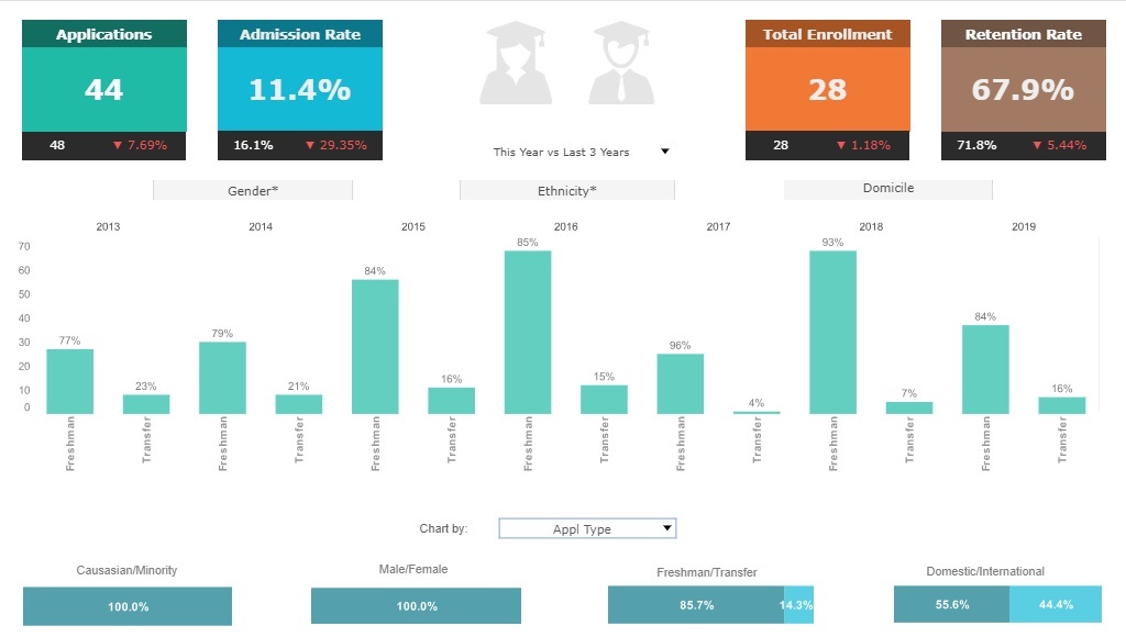
This college admissions analysis breaks down admissions by various demographic and psychographic factors, such as race, gender, major type, transfers, and year.
Large, easy to read text KPIs display the dashboard's most important aggregates, with percent change from previous period displayed underneath them.Popular Music

This flexible dashboard by InetSoft can be easily embedded into applications to help creators find the next hot music genre in certain areas.
In the example dashboard, the most important audio features impacting popularity are identified by regression model. Moreover, end user can deep dive into the music fusion by checking simulated decision tree of genre classification.
Police Deaths
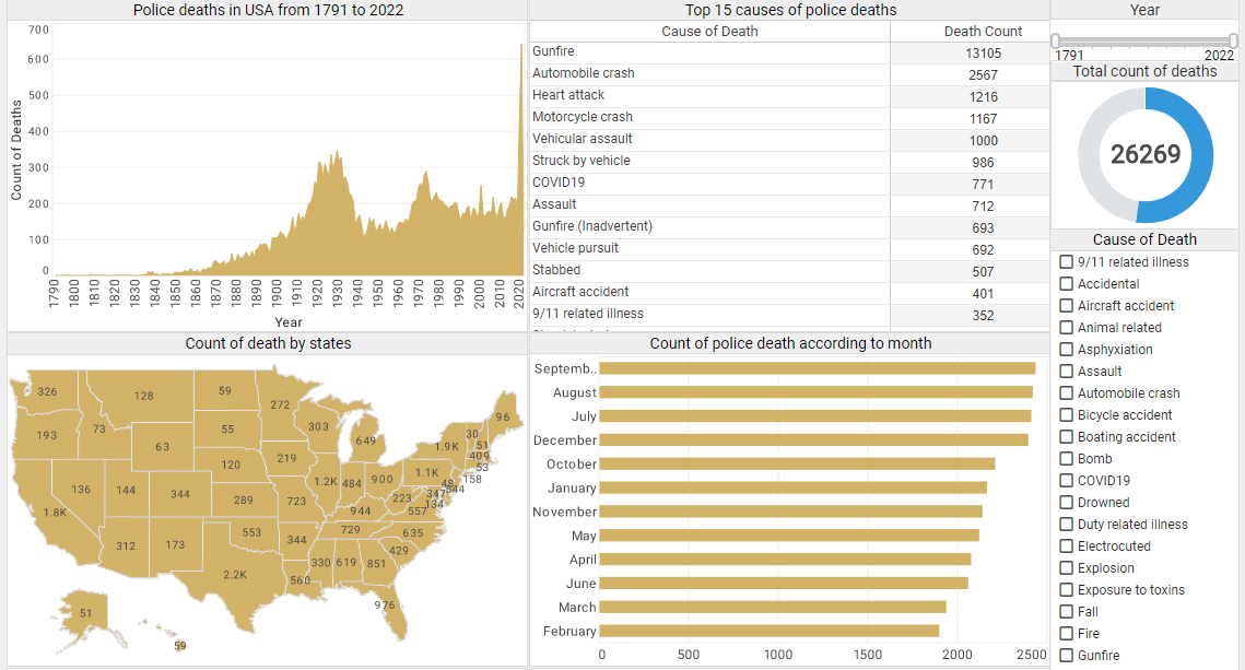
This interactive Police Force Deaths Analysis Dashboard that displays police fatality data since 1791, across 17,985 police departments in the United States. The visualization's charts and tables let users comprehend these vast amounts of data at a glance in a more efficient way. The dashboard also incorporates several tables to allow users to dive deep into more details. The tables list the top 15 death causes, the top 15 types of police officers in the most danger, and the top 15 departments with the most police deaths, providing details of police deaths that are the most relevant to analyze from an abundant amount of data.