Dashboard Reporting Examples
Since 1996, InetSoft's dashboard software StyleBI™ uses a reporting-driven approach to enable rapid deployment of BI dashboards. They are business user-driven and offer strong reporting tools and functions. Dashboard software has been established as a highly effective business intelligence tool. Our dashboards can be monitoring-oriented or reporting-oriented and are a foundation of performance management software.
StyleBI is not a desktop application. It is web based server application and that can be accessed by any device. It can work with or without flash plugins and is accessible on mobile devices. Take a look at the versatility of BI implementations with InetSoft's dashboard software. Click on the dashboard reporting images to get a better look:
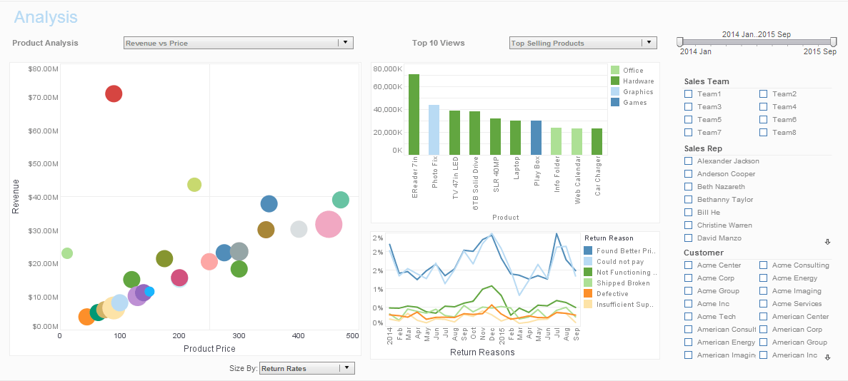
Sales and Returns Dashboard Reporting Example

The sales and returns reporting dashboard example exhibits analysis of product sales by charting revenue vs. price, top selling products, return rates, and return reasons.
These sales KPI's are a good way to get a better picture of the sales health of an organization.
Executive Regional Performance Dashboard Example

This executive regional performance dashboard example gives a broad visual breakdown of revenue, prices, and profits, by product line. Color is used in several of the charts to add another dimension. The live version features a mouseover chart, packing in even more information without wasting dashboard real estate
Sales Exploration
By Product Example

This product sales exploration example breaks down sales and returns by region and product category.
A trend line helps explore the correlation between sales revenue and product returns, with each product category specified by a distinct color.
Patient Satisfaction Research Dashboard Example

This patient satisfaction dashboard shows patient satisfaction across a variety of measures. A series of sparklines show recent changes in satisfaction, alerting the dashboard user to areas of concern.
Orders by State
Dashboard Example

This orders dashboard example breaks down orders by state and by salesperson.
Each salespersons's goals are marked with a diamond shape, displaying how their performance compares to their benchmarks.
University Admissions
Metrics Dashboard
This university admissions metrics dashboard breaks down admissions by various demographic and psychographic factors, such as race, gender, major type, transfers, and year. Large, easy to read text KPIs display the dashboard's most important aggregates, with percent change from previous period displayed underneath them.
Regional Marketing Lead Report Example

This regional marketing lead report example displays important aspects of the sales funnel, by displaying leads by source, state and date. The chart above includes a highlight feature based on monthly change rate, whose threshold can be adjusted using a slider which modifies the change rate that results in a chart highlight.
Global Supply Chain Dashboard Example

This global supply chain dashboard example makes it easier for managers to analyze the their supply chain.
Large, easy to read map and bubble charts are used, with the end result displaying the relationship between inventory and shipping timetables.
Lead Creation Dashboard Sample

This marketing lead creation dashboard sample gives an overall picture of new leads, their sources, and their conversion rates. This leads by date chart includes a highlight feature based on monthly change rate, whose threshold can be adjusted using a slider which modifies the change rate that results in the chart highlight changing.

