Interactive Visual Analysis Example
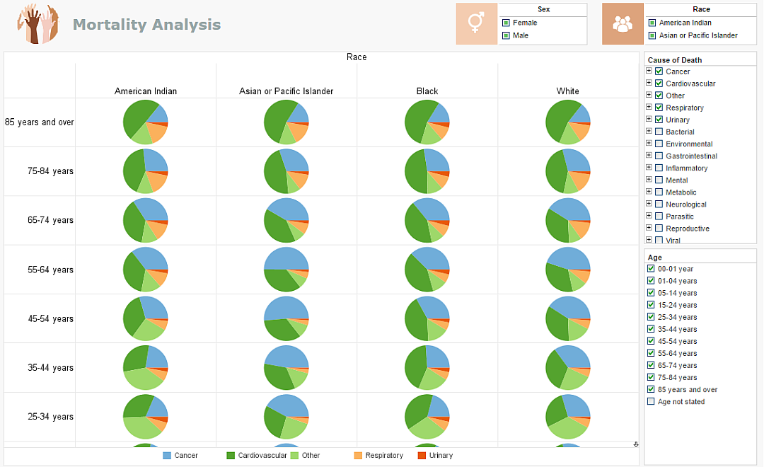
The Interactive Visual Analysis Example below portrays the rich and interactive nature of InetSoft's dashboard software. A web-based analytical dashboard, the chart below uses InetSoft's own Data Block patent technology for data mashup purposes, serving as an effective way to analyze multi-dimensional data.
A powerful and effective capability of InetSoft's dashboard solution, demonstrated below, is the simple sorting mechanism that users have control over. Filtering and sorting is easily done with the radio buttons and color coordinated bar chart that includes an array of categories, causes of death, gender, age, and race. Users can take another step and add more charts, data sets, and/or filtering options for further analyzation. InetSoft's solution is geared towards a user-friendly interface that includes an arsenal of useful tools when creating, monitoring, adjusting, or analyzing.
As a pioneer in business intelligence, InetSoft offers only the best tools for dashboard, report, or visual creating while focusing on user- friendliness, user-interactivity, and user objective.
| Try It Now | Click on the example below to see how easy it is for users to filter through different data for an in-depth look at desired results! |

Capabilities of InetSoft's Interactive Visual Analysis Example:
- Compare and analyze data by utilizing customizable filtering options
- Easy-to-use point-and-click environment for quick data analysis
- Share visual analysis with others
- Analyze charts and graphs and then select other tabs to see other views or drilldown into details
- View data from multiple sources and formats on one dynamic screen

InetSoft's BI application makes a good choice because it's:
Easy
- Enjoy a rapid implementation; minimum specialized IT expertise required
- Experience a shallow learning curve for business users; only Excel-level skills needed
- Make it easy for analysts & administrators; no SQL experience required
- Scale up with zero-client deployment and no per-user licensing
Agile
- Provide maximum self-service through ad hoc and visualization analysis
- Enable self-service also at data level: end-user defined data mashup
- Accommodate quick, formal, and experimental changes
Robust
- Address advanced and mass needs
- Run on a high performance, secure infrastructure
