Big Data
InetSoft's StyleBI can natively access big data stores such as Cassandra, Hbase, MongoDB. This is because StyleBI's big data deployment is natively built upon Apache Spark/Hadoop. It can not only be dropped into an existing big data environment, but it can also be deployed with its self-managed environment

Bring Dashboards and Reporting to Your Big Data
InetSoft's StyleBI drops into an existing Apache Spark installation. This bring-the-software-to-the-data approach eliminates costly big data movement for analytics and reporting. Style Intelligence can also be deployed with its own built-in Spark cluster.
In this case, only minimal expertise in Spark is required. The cluster is mostly configured and administered by StyleBI behind the scenes to maximize data processing and mashup performance.
Big Data and Data Lake Analytics
Big data platforms have made data lakes possible where data, mostly in raw format, is stored for future analysis. Data lakes have become a viable, sometimes even preferred, alternative to data warehouses. Since they operate off raw data by design, the approach for data analytics comes from a very different direction. InetSoft's native Spark integration makes data lakes accessible like all other data sources.
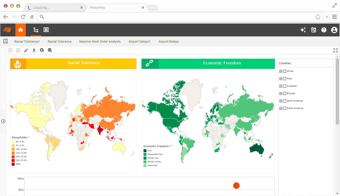
How a Jitney Operator Uses StyleBI for Visual Analysis of Big Data
A modern jitney operator — a small, nimble shared-ride transit business — can transform its operations by treating every trip, fare, and device ping as part of a large data ecosystem. Using StyleBI for visual analysis turns that raw mass of information into intuitive dashboards and actionable insights. This piece walks through the data flows, the dashboards that matter, how to influence core metrics, and practical implementation tips. I’ll also be frank about trade-offs and why StyleBI’s embedded, flexible visualization approach is particularly well suited to small- and medium-sized transit operators.
Why big data matters to a jitney
Jitneys operate at the intersection of on-demand demand, local traffic patterns, vehicle utilization and customer experience. Data comes from many sources — mobile booking apps, vehicle telematics (GPS, engine diagnostics), driver logs, payment systems, rider surveys, and municipal APIs (traffic, events). Individually these sources are useful; combined they allow the operator to forecast demand, optimize routes, reduce downtime, and improve margins. But big data only becomes business value when it’s accessible. That’s where StyleBI’s visual layer pays off: it aggregates, models and surfaces the most relevant signals in a way humans actually use.
Core dashboards a jitney operator needs
- Real-time operations dashboard: live map of vehicle locations, pickup/drop-off statuses, minutes-to-pickup percentiles, and alerts for stranded drivers or missed windows.
- Demand & supply balance: heatmaps showing ridership concentration by time of day and neighborhood, plus a supply index showing available vehicles per demand cluster.
- Route performance and routing exceptions: route-level KPIs like on-time rate, dwell time, average speed, and common detours.
- Maintenance & telematics: OBD-II fault trends, preventive maintenance schedules, fuel or battery consumption anomalies, and cost per mile.
- Financials & pricing analytics: fare mix, revenue per driver-hour, subsidy reconciliation, and elasticity testing for dynamic pricing pilots.
- Customer satisfaction & feedback analytics: NPS trends, complaint categories, and correlation views that tie service events (delays, route changes) to drops in satisfaction.

What the visualizations actually show
StyleBI makes it simple to craft layered visualizations. For example, an operations map overlays vehicle density (choropleth), live vehicles (icons with status), and demand intensity (animated heat contours). Drilldowns let dispatchers click a hotspot and instantly see pending requests, driver ETAs, and historical patterns for that block. Time-series sparklines show service vagaries across the day; scatterplots reveal the relationship between on-time performance and driver experience; stacked bars break revenue by channel (app, street-hail, contract). These visual cues reduce cognitive load and accelerate decisions.
KPIs to track and how to affect them
- Average Wait Time: measured from booking to pickup. Reduce it by tightening driver staging near demand clusters, offering micro-incentives to drivers to move toward anticipated ridership, or creating virtual staging zones in peak windows.
- Vehicle Utilization: percentage of operating time spent carrying passengers. Improve utilization with smarter matching algorithms, multi-stop batching, and demand-responsive scheduling.
- On-time Rate: bookings completed within promised windows. Influence this by predicting traffic delays with historical congestion layers, dispatching earlier for high-variance routes, and giving drivers dynamic re-routing suggestions.
- Cost per Mile / Revenue per Mile: combine telematics with fares to see margin. Lower costs with preventive maintenance (identified through fault-code pattern detection), fuel-efficient routing, and tighter deadhead reduction strategies.
- Customer Satisfaction: measured through short post-ride surveys. Improve scores by exposing drivers to short feedback loops, coupling incentive pay to satisfaction, and reacting quickly to recurring complaint categories surfaced by StyleBI text clustering.
Demand forecasting and micro-scheduling
One of the biggest advantages is being able to forecast at a fine granularity — by block, by 15-minute window. StyleBI can visualize probabilistic demand models using layered charts: predicted demand vs. actuals, confidence bands, and driver availability overlays. With these visuals, operators can experiment with micro-schedules (temporary pick-up hubs, surge driver shifts) and immediately measure impact. My opinion: the MVP for most jitney operators is a rolling 24-48 hour forecast dashboard; anything more granular becomes useful once the data density supports it.
Integrating telematics and driver behavior
Telematics data is noisy but revealing. StyleBI dashboards can flag drivers whose braking patterns correlate with increased maintenance or low satisfaction, or highlight recurring idling hotspots that blow fuel budgets. Visual anomaly detection — such as sudden drops in average speed on specific route segments — helps the operator distinguish between systemic issues (roadworks, policy changes) and isolated driver-level behaviors. That enables targeted coaching rather than blanket punishments.
Operational playbooks powered by visuals
Data without playbooks is a missed opportunity. The effective jitney operator creates simple response flows tied to dashboard triggers: if wait time in Zone A exceeds X, automatically push an incentive to two nearby drivers and open a temporary staging marker; if a vehicle reports a fault-code Y twice in a week, schedule a maintenance slot and flag similar vehicles for inspection. StyleBI’s visual alerts and drillable analytics make these playbooks practical because humans can see the problem and its context instantly.

Regulatory & contract reporting made easier
Many jitneys operate under local permits or with municipal contracts that require periodic reporting. StyleBI simplifies compliance by templating reports and visualizations that match regulatory requirements — route adherence, incident reporting, ADA compliance metrics or subsidy reconciliation. Instead of assembling spreadsheets manually, operators can export dashboard snapshots or scheduled reports, saving hours and improving accuracy.
Challenges and trade-offs
No tool is a silver bullet. Data quality is the core challenge: inconsistent driver logs, partial telematics coverage, and intermittent connectivity can muddy insights. There’s a risk of analysis paralysis — too many panels, too many metrics. StyleBI helps by enabling role-based dashboards: drivers see simple, motivational metrics; dispatchers see real-time operations; managers see long-term trends. Another practical trade-off is cost vs. value; smaller operators should focus on three to five high-leverage dashboards first and expand only when each new dataset demonstrably improves a KPI.
Implementation roadmap — pragmatic steps
- Inventory data sources and prioritize by impact (bookings, GPS, payments first).
- Build a real-time operations dashboard and a daily summary dashboard as the initial MVP.
- Define 3–5 KPIs with clear owners and thresholds for alerts.
- Run a 30-day experiment: deploy insights from StyleBI into dispatch rules and measure KPI shifts.
- Scale to forecasting, maintenance analytics, and customer sentiment once basic processes are stable.

Why StyleBI fits a jitney operator
StyleBI’s strength for this use case is pragmatic flexibility. It embeds into applications, connects to streaming and batch sources, and supports interactive visuals that different roles actually use. For a nimble operator that needs to iterate fast on routing, pricing, and driver incentives, being able to prototype dashboards, deploy them to dispatch screens, and revise visual logic without heavy engineering cycles is a huge advantage.