BI Visualization Samples
Below are some BI visualization samples to give you a look at some of the unique analyses and dashboards that can be created using Style Intelligence. The samples span many different industries and departments. Each visualization sample was built using Inetsoft's drag and drop technology, no coding required. This easy to use dashboard builder is bolstered by robust data mashup that can combine necessary data from any source.
Maintenance Visualization

This maintenance efficiency visualization sample displays the percentage of work orders started and completed, and tracks the man hours necessary for completion of said work orders. A number of line charts display the fluctuations in these various measures over time, enabling managers to pinpoint where specific issues occurred. Improvements in production time are highlighted in green, where as increases in man hours are highlighted in red.
Live Call Center Visualization
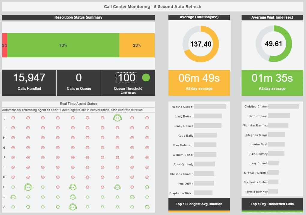
This live call tracking visualization helps call center managers supervise their customer service reps. An agent status chart shows, in real time, who is on the phone and for how long. Large KPIs provide the daily call and wait time average, giving managers an at-a-glance picture of customer service quality.
Workplace Accidents Visualization
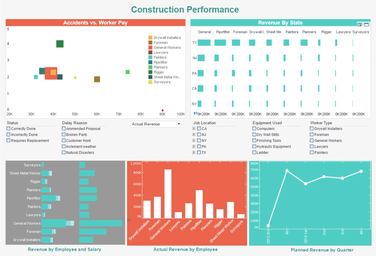
This visualization helps property developers track construction accidents, in the hope of improving worker safety. Drilldown buttons on the Revenue by Quarter chart enables the user to pinpoint periods of high and low activity. An accidents vs worker pay chart help identify certain types of work that are prone to jobsite accidents, and addresses the question of whether additional compensation increases worker attentiveness.
Social Media Campaign Visualization

This social media campaign visualization can free business users from juggling multiple social media channels across various platforms, and allow them to monitor accounts and track engagement metrics all in one place. The dashboard consists of a combination of easy-to-understand charts such as summary charts, line charts, bar charts, and pie charts to present engagement information across multiple platforms, and uses interactive filters to simplify the process of making analysis and comparisons.
Music Trends Visualization

This music metrics dashboard example by InetSoft can be easily embedded into applications to help creators find the next hot music genre in certain areas. In the example dashboard, the most important audio features impacting popularity are identified by regression model. Moreover, end user can deep dive into the music fusion by checking simulated decision tree of genre classification.
Hurricane Visualization Sample
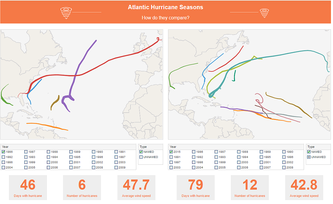
This hurricane visualizations an example of how map charts can provide insight into spatial phenomena. The two map charts operate independently with their own filters, allowing for easy comparison of year to year. The path of each storm is tracked with a uniquely colored line.
Product Returns Visualization

This product return visualization dashboard highlights how a dashboard can incorporate many different pastel shades and not be overwhelming. Product categories are each given a unique color and bubble, with a trend line to help give an overall picture.
This allows color to be used as an additional dimension on both dashboard charts. Hovering the mouse over any of the colored data points reveals which categories are signified by which colors.
Marketing Leads Visualization
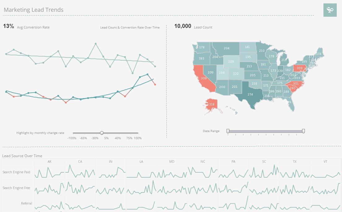
This CMO dashboard example gives Chief Marketing Officers the metrics they need to monitor sales pipelines and optimize strategy. Lead count and source are tracked as well as conversion rates, with monthly change highlighted based on slider selection. States with a high concentration of leads are indicated by an orange color
Streaming App Visualization Sample

This online streaming analytics example offers the managers at streaming companies not only an overall understanding of their user base, but also detailed analytics and comparisons of diverse channels.
This dashboard manages to triangulate target audience positioning and video content improvement, improving business value and ROI for companies that offer video streaming applications. Two map charts display the states with the most active users.
Manufacturing Quality Control Visualization

This Manufacturing Quality Control template enables quality control managers to monitor and analyze everything, from defects rate and pipeline duration to shift performance and technician performance, all in one dynamic view.
With built-in filtering components, manufacturing professionals can easily slice and dice data with simple point-and-click methods to get various insights.
Fuel Efficiency Visualization Sample
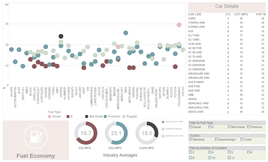
This visualization displaying the amount of fossil fuels burned by various vehicles once again displays the utility of having color as an extra dimension.
A radio button changes the means by which efficiency is measured, enabling a simpler, clearer dashboard layout. A table displays the individual models and their fuel use.
Sales Team Visualization Sample

This sales-by-state sales performance report gives a broad visual breakdown of revenue, prices, and profits, by product line. Color is used in several of the charts to add another dimension. The live version features a mouseover chart, packing in even more information without wasting dashboard real estate.
Mortality Risk Visualization
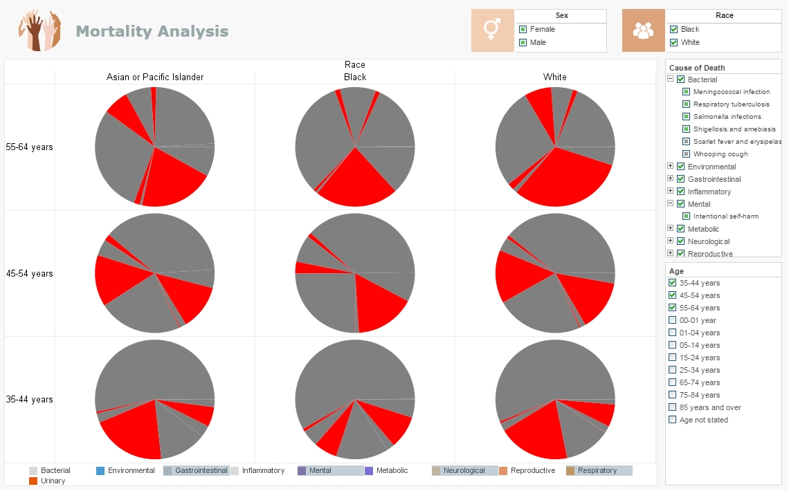
In this mortality risk visualization example you can easily wring out a huge variety of statistics surrounding national mortality. The visuals can be displayed by age, race, gender or cause. You can filter out specific diseases within each Cause or zoom in for an intimate analysis within certain communities. Easily spot the major causes or drill down to find the way certain causes affect demographics differently.
Sales and Profits Visualization

This sales and profits visualization features a geographical map chart, displaying each country's share of global profit, colored once again using monochromatic scaling. Since countries are recognizable by shape, a map chart can omit country names, making the chart less cluttered. While color shade gives an overall visual impression of how particular nations compare to the rest, the addition of text labels enables the viewer to compare nations with similar figures.
COVID-19 Visualization
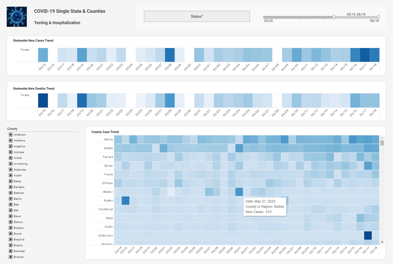
This COVID-19 visualization uses monochromatic scaling, or different shades of the same color, to display the number of new cases each day. Whereas distinct colors in a dashboard usually signify the discrete categories of a dimension, multiple shades of the same color signify a measure.